Do you have any pet peeves about a Pool Cue's appearance?

cubswin

Just call me Joe...
Silver Member
Mushroomed tips, chalk rings, dings on the shaft are all things I don't like. My main player needs a refinish, as it has some dings on the butt that bug me.

I don't like floating points either, but a cue with boxes instead of points I like. Also don't care for butt sleeves that are of different wood than the points on pointed cues.

Oh and I hate leather and snakeskin wraps.
 

Ssonerai

AzB Silver Member
Silver Member
I like the vision & creativity, & appreciate the intense craftsmanship in a lot of cues i'd be embarrassed to be seen with personally. Most styles suit or appeal to someone so who am i to argue with taste?

That said, preference is for simple cues; generally full splice & generally low gloss finishes. The only thing that really sets me off wrong is ebony cues with high shine automotive finish that makes it look like a piece of hard plastic. Could be anything except wood, from the looks. Even paint. What a waste. Give me a spit coat of shellac ("French Polish"), & wax to a low sheen with some grain showing to bring out the real for ebony.

smt
 

Kim Bye

AzB Silver Member
Silver Member
Coloured ferrules and coloured perspex pads.
All white cues, when its not a natural white (like Holly) those white Predator and Peri cues is a prime example.
Big ugly logos, the Predator panther logo might be the worst.
Metal buttcaps.
Airbrushed cues and "brand" cues like the Mcdermott Harley cues. (the same goes for sports themes)
Malachite inlays and overly large plastic inlays like Meucci and Viking uses alot.
 

Kickin' Chicken

Kick Shot Aficionado
Silver Member
if you make a cue and are going to hand sign it, please have great penmanship. If you don't have a good looking signature, get a logo made and use that instead.

If you have a neat signature and are signing in between the points, please, unless requested to do otherwise by the customer ordering the cue, sign it so it's right-side-up when right handed players (the vast majority) are shooting.

my ocd is giving me a headache...

Oh wait, that must be my hypochondria... :grin-square:

oh, and floating points..............:(
 

Bavafongoul

AzB Silver Member
Silver Member
Points & Veneers.....every cue should use them in the design and overall appearance of the cue.
 

Black-Balled

AzB Silver Member
Silver Member
Points & Veneers.....every cue should use them in the design and overall appearance of the cue.

Dammit! I often complain about how wordy you get. Now you finally post a short one and I got no clue what you mean.

I'm not smart enough to complain.

Dammit.
 

Push&Pool

Professional Banger
Silver Member
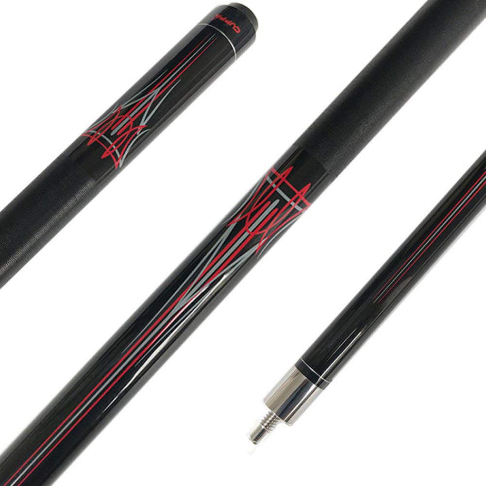
- simplistic black or red-and-black color design
- 13 mm tip
- 19-20 oz
- no wrap or leather wrap

Actually, while all of the above is true, what's most important to me is for the cue to look and feel just right. My cue is sort of like the extension of myself, so the feel and design need to align with my personality. It's weird, but only when I see a cue can I say I want to play with it. No amount of money or quality alone can provide me that "connection", I'd rather have a cheap cue that I can effortlessly consider a part of me during a game.

The cue I recently ordered fits everything mentioned above perfectly. I'll post some photos of it in a few days. Another cue I was personally impressed by was this one:
61jHbvR7SBL._SL1001_.jpg
 

muskyed

AzB Silver Member
Silver Member
I am so glad that I read this post, and have found out how much a silly chalk ring on another players cue bothers some people. I always assumed that when I play better players in my weekly league, some of whom are state champions, that their focus of attention was on their game, not the condition of my cue. After reading this, I for sure will be putting a big ole chalk ring on my cue before playing them again. I'll take any advantage I can get.
 

Push&Pool

Professional Banger
Silver Member
You gotta be yanking chain with that decal/painted abomination.

If it doesn't fit your preferences that's ok, but calling this beauty an abomination is too much. Maybe I have an unusual taste in cues, however, note that I've literally seen hundreds of models, both expensive and cheap, over the last month or so, and this one is second only to the one I bought when it comes to design. I'm not talking about build quality or anything like that, just pure appearance.
 

AlexandruM

AzB Silver Member
Silver Member
Don't like:
- Bumperless cues
- Stained wood and cues with unnatural colors
- Predator P3 cue :)
 

noMoreSchon

AzB Silver Member
Silver Member
I guess I am easy. I have 2 schons, one with floating points, and a LTD with turquoise.

I like box cues. Not into leather wraps, or finished (Meucci) wraps. But have owned both.

What drives me crazy, is a but cap that is 4 inches long...Why? You know the ones I am

talking about. Malachite is a no-go. I have seen some great butterfly cues I would snatch

up if given another chance. Another one is those Pechaures with inlays in the shaft, I

like them, but definitely not for me. Like I said, I am easy going and know that someone

out there must be a buyer for all the ugly...(pin striped cues included)
 

marinemike0931

Registered
Definitely different strokes for different folks... Half of the most common hated things can be found in my Jacoby HB7... Turquoise, floating points, a hand written signature and date, points on the butt sleeve. And I think it's a beautiful cue.

I'm about to have a cue made that most of you will hate as well. It's going to have floating points, a white lizard wrap, spears on the end of some of the points, lots of inlays, down pointing floating points on the butt sleeve, white snake juma, and a wood joint collar... Oh and it'll have a greyish black CF shaft attached to the end.

Things I don't like:
Badly maintained cue
Flat tip worn down almost to the ferrule
Linen wraps
Most Meucci cues
Uni lock joints
Full splice cues (look like a house stick)
Butterfly points
Shit brown wood colors (like bacote, which my Jacoby has).

Here's a pic of the most hated cue in this thread and a rendering of what will be the second most hated
d7aa97ecd2487f23318042c744f010ad.jpg
e1081e6474bf1de8a80ed72f1741dfcf.jpg
3ab16c0f956bba24e803bb19656d52e2.jpg
92ab6f129696d6e370e1acdb10f8950c.jpg


Sent from my LM-V405 using Tapatalk
 

Sunchaser

Belgian Malinois
Silver Member
I don't mind floating inlays at all. I don't mind turquoise either. I prefer the southwestern flavor actually. I like ivory points too. I will agree that ringtail wraps in general ruin most cues because they are very distracting.
It's so funny that everyone seems to dislike rounded points and inlays. Tips are rounded. Pockets are rounded. The cue itself is round. Those 16 balls on the table are round. The quarter on the table I keep moving up a dot at a time is round. Boobs are round. Big butts are round....I really kinda like round. You're probably kinda super bummed if a just cleaned your clock with one of my rounded floating point cues. Too funny.
 
Top