You are using an out of date browser. It may not display this or other websites correctly.
You should upgrade or use an alternative browser.
You should upgrade or use an alternative browser.
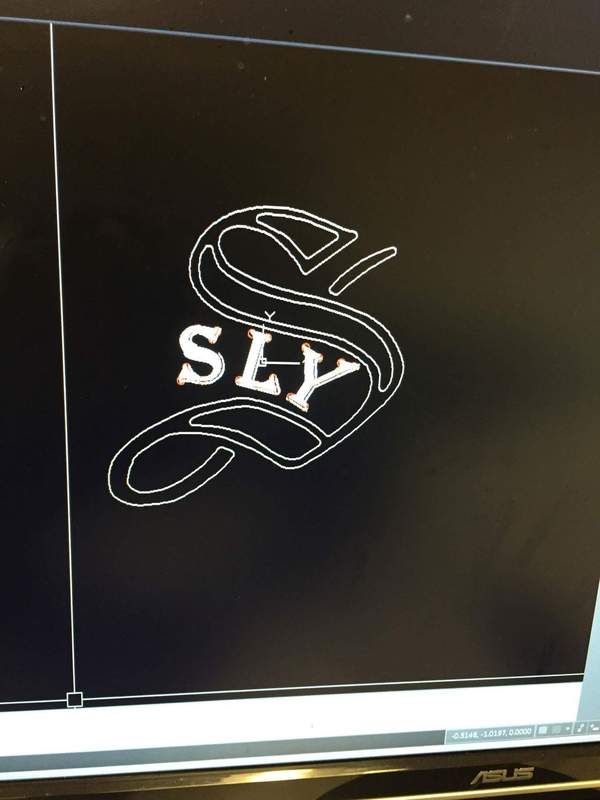
Logo new to me!!!
- Thread starter leon sly
- Start date

Leon,
I am am big admirer of your workmanship and creativity. The new logo looks a bit off to my eye.
Please don't take offense but the floating inlay at the top of the S and the extended curl on the
bottom take away from the sleekness of the logo, at least in my opinion. I think if you made the
top & bottom to resemble one another, it would look more sleek, symmetrical and distinctive.
Logos are important, as well as signatures for those cue-makers that sign their cues. A cue-maker
has to have decent penmanship if they decide to sign their cues and logos help establish your brand.
Now the problem will become all your customers will like it so much it will be requested on every cue.
Matt B.
")
If you're thinking a new logo for a banner, t-shirts, stickers etc. I'm a fan...
If you're thinking logo for your cues I'm not a fan,,
It's too busy, and it reminds of a production cue company logo..
I think most prefer a simple logo, or signature
Let your work continue to be the focal point..
If you're thinking logo for your cues I'm not a fan,,
It's too busy, and it reminds of a production cue company logo..
I think most prefer a simple logo, or signature
Let your work continue to be the focal point..
If you're thinking a new logo for a banner, t-shirts, stickers etc. I'm a fan...
If you're thinking logo for your cues I'm not a fan,,
It's too busy, and it reminds of a production cue company logo..
I think most prefer a simple logo, or signature
Let your work continue to be the focal point..
I have to agree with this as well. Would look good on your business cards, t shirts, etc but if i was buying one of your cues i would either want the current logo or possibly a small signature somewhere.
Your cue work is fantastic.
^^^ I agree with Bava,and sometimes less is more,best of luck regardless !!!Leon,
I am am big admirer of your workmanship and creativity. The new logo looks a bit off to my eye.
Please don't take offense but the floating inlay at the top of the S and the extended curl on the
bottom take away from the sleekness of the logo, at least in my opinion. I think if you made the
top & bottom to resemble one another, it would look more sleek, symmetrical and distinctive.
Logos are important, as well as signatures for those cue-makers that sign their cues. A cue-maker
has to have decent penmanship if they decide to sign their cues and logos help establish your brand.
Now the problem will become all your customers will like it so much it will be requested on every cue.
Matt B.
Johnny Rosato,B'ham,Al
TO BE USED ON HIGHER END CUES.
BLK BORDER WITH SILVER INLAYS
It is different and looks good I too like the SLY logo it quick to identify cue, But change may be confusing on who the cuemaker is. You are the creator and if it is your will so be it. Love all the slys I have in my collection keep up the great work. Always looking to adopt other SLYS :thumbup:
I like the one you have. Just saying.
Agreed...If it ain't broke, don't fix it.
There's only 7 letters tp your name. A signature "Leon Sly"
in a script with a fancy L and fancy S would look elegant.
in a script with a fancy L and fancy S would look elegant.