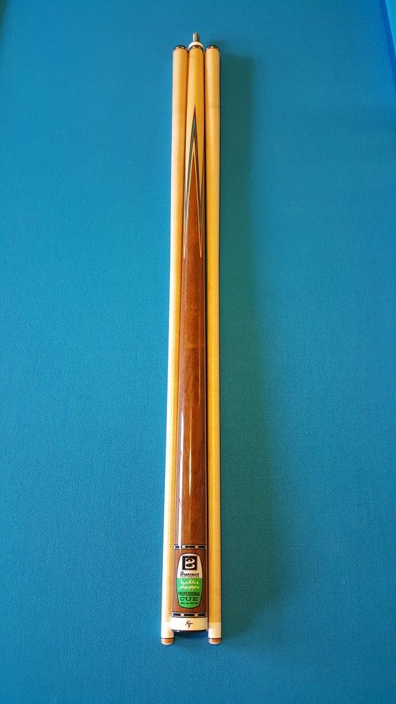
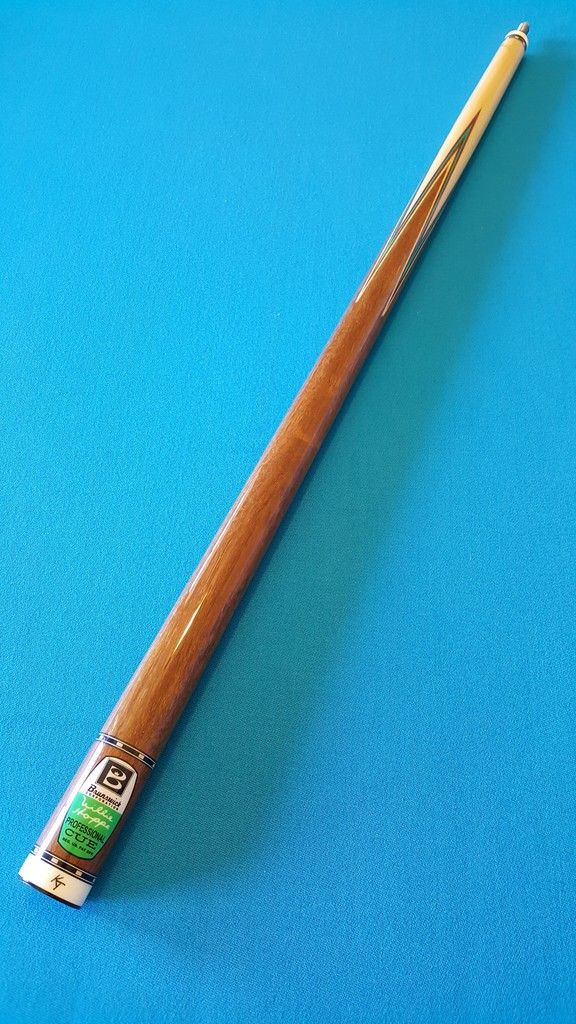
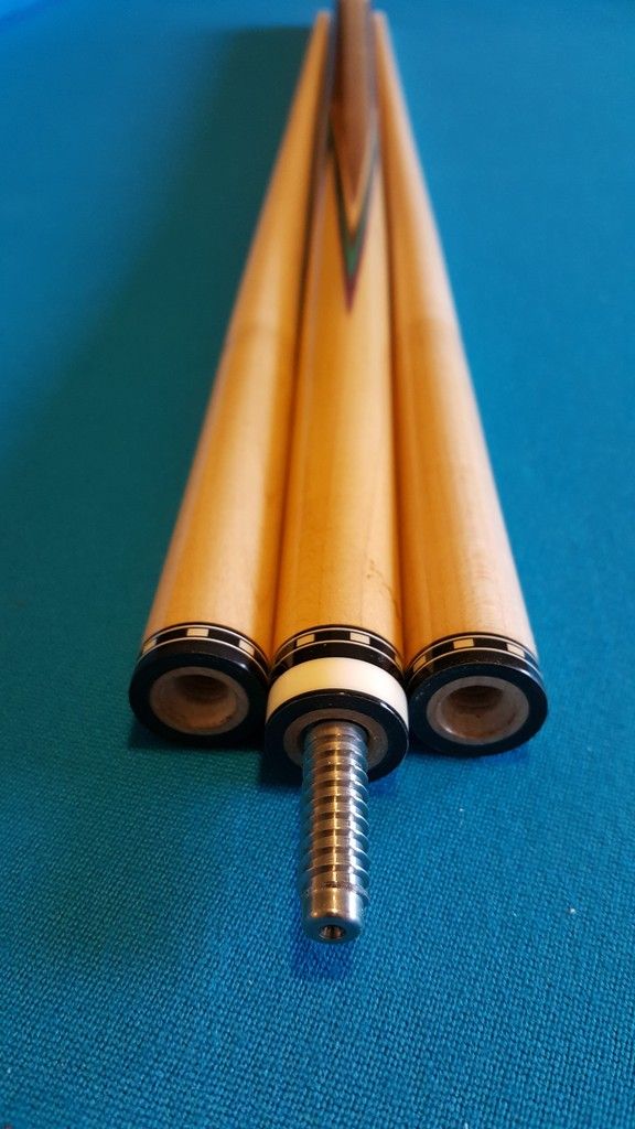
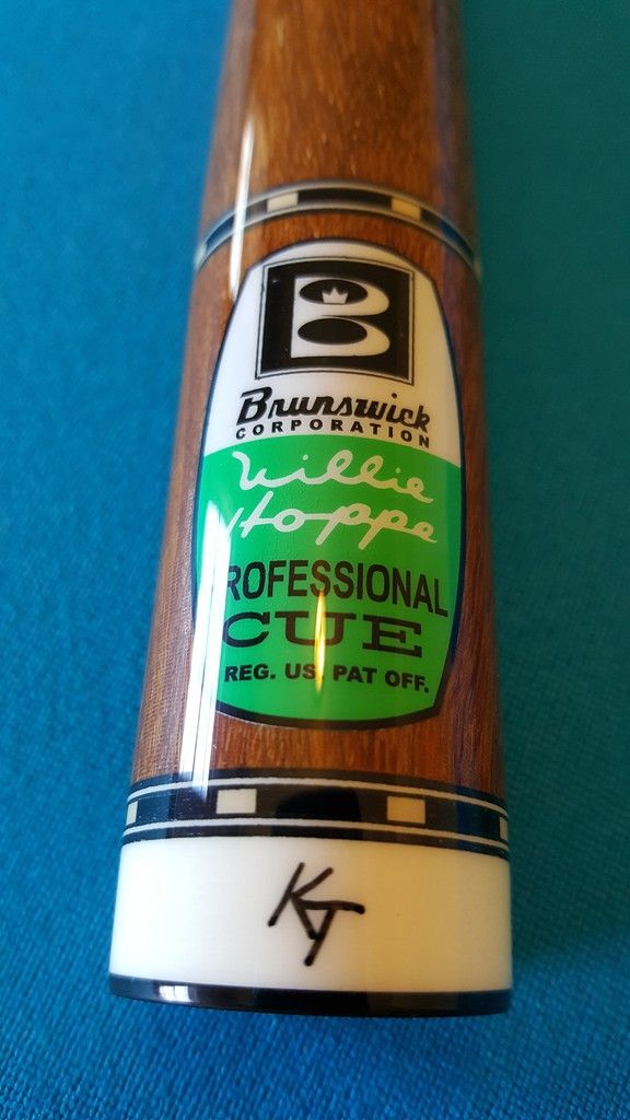
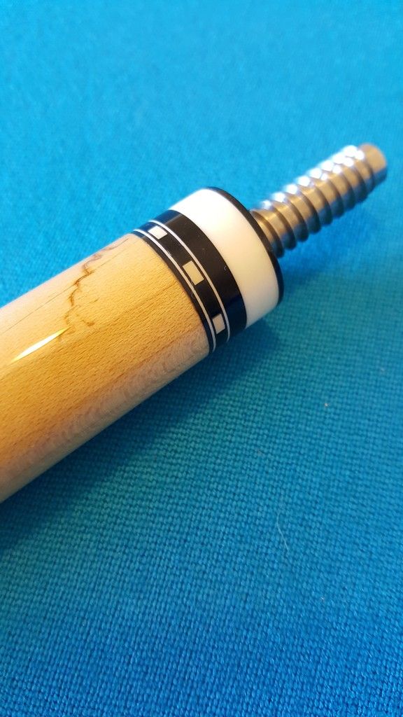
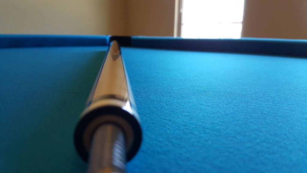
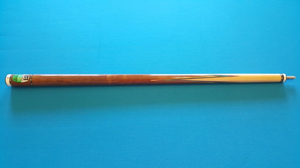
Here is an old Hoppe Pro Titlist that I just finished a wrapless conversion on for a friend of mine.
Opinions & criticism more than welcomed.
Thanks for looking
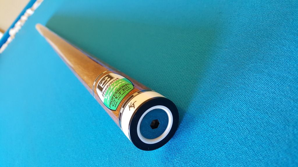
Opinions & criticism more than welcomed.
Thanks for looking


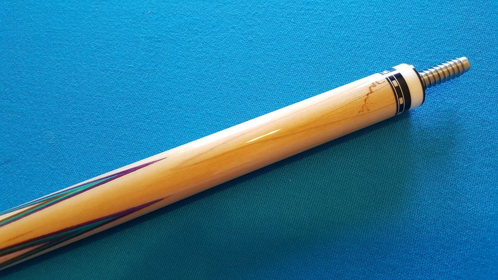
 Hehe!
Hehe!

