You are using an out of date browser. It may not display this or other websites correctly.
You should upgrade or use an alternative browser.
You should upgrade or use an alternative browser.
Reflection 360
- Thread starter 63Kcode
- Start date
..............................
Please repost your picture. Just proves great minds think alike. And then there is us. We think alike too
Larry
Please repost your picture. Just proves great minds think alike. And then there is us. We think alike too
Larry
I was amazed that your cue looked so much like mine, so I posted up a pic, then took it down because I didn't want to butt in with my pics in your thread
") But since you're good with it, I'll take a cleaner pic. That one was gritty.
But since you're good with it, I'll take a cleaner pic. That one was gritty. On another note, I understand how tricky & frustrating it is to get the base of the points the same size, and stay the same size. The angle pitch on the back is much more severe than the front, so the depth change is not proportionate as you make cuts to final size. I had to make the back half of mine three times before I got it right.
I was amazed that your cue looked so much like mine, so I posted up a pic, then took it down because I didn't want to butt in with my pics in your thread
On another note, I understand how tricky & frustrating it is to get the base of the points the same size, and stay the same size. The angle pitch on the back is much more severe than the front, so the depth change is not proportionate as you make cuts to final size. I had to make the back half of mine three times before I got it right.
This post is more about the style. Not the cue blank. That's why I enjoyed seeing your take on it.
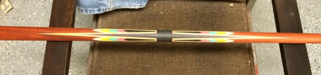
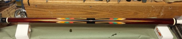
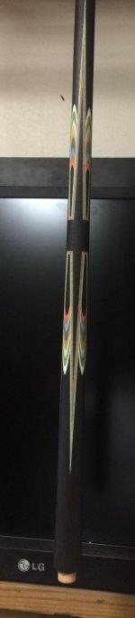
Been wanting to do the 360ish thing for a while. With the points going the regular way the bridges looked clunky. Funny thing is, I hate reverse points, because they look short and clunky. After seeing one of TWs cues. This idea stuck in my brain as workable, but not clunky.
Larry
I was amazed that your cue looked so much like mine, so I posted up a pic, then took it down because I didn't want to butt in with my pics in your thread
On another note, I understand how tricky & frustrating it is to get the base of the points the same size, and stay the same size. The angle pitch on the back is much more severe than the front, so the depth change is not proportionate as you make cuts to final size. I had to make the back half of mine three times before I got it right.
I would love to see it.
I love it when you guys can compare and contrast your work in good spirit. :thumbup::thumbup:
.
This post is more about the style. Not the cue blank. That's why I enjoyed seeing your take on it.
Been wanting to do the 360ish thing for a while. With the points going the regular way the bridges looked clunky. Funny thing is, I hate reverse points, because they look short and clunky. After seeing one of TWs cues. This idea stuck in my brain as workable, but not clunky.
Larry
Definitely not clunky....and I know what you mean about reverse points.
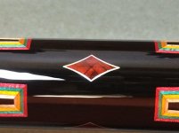
I think your interpretation of the design is very interesting. I really dig antique butterfly cues and I really dig designs that borrow from that...360 or otherwise.
Beyond the technical difficulties of getting the bases of the points right in respect to the taper as well as getting everything to line up while maintaining centers, I admire your use of the colors and woods in this cue. It is striking. It shows design awareness beyond the mere geometry of getting all the points and butterflies right.
I have said it before, you are an artist in the finest sense. IMHO what you are producing here is an instant classic.
I look forward to seeing more of this cue.
.
Thanks for looking!
Wow, talk about beautiful!
This cue is special.
Both the design and choice of woods and colors are wonderful.
Thanks for sharing.
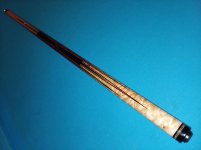
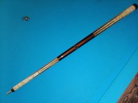
And that is for #1! Cue #2 jumps out of the picture and right into my hands!
Will Prout
Last edited:
That ebony one though.... Ooooo weee!
Nice to see this thread again.
And nice to see you working on another cue in that style.
Thanks for showing off! :thumbup::thumbup::thumbup:
.
Thanks! Took a while till I acquired enough guts to try another.
Larry