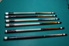
So - after playing with this design for quite a while, this is what I landed on. Mike Gulyassy will be making this one. I had some questions or solicited feedback. I'm going for "classic-modern"
-I have Birdseye on the forearm but was thinking of straight grain maple instead.
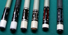
-I added the dots to fill in the sleeve a little - any other ideas here? I thought they were a fairly classic item seen in old
-Any thoughts on the length of the butt cap, or ratio of forearm to handle?
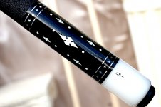
-Do you think the check rings are too thick?
Any feedback is appreciated.


-I have Birdseye on the forearm but was thinking of straight grain maple instead.
-I added the dots to fill in the sleeve a little - any other ideas here? I thought they were a fairly classic item seen in old
-Any thoughts on the length of the butt cap, or ratio of forearm to handle?
-Do you think the check rings are too thick?
Any feedback is appreciated.


") Good luck.
Good luck.