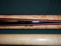
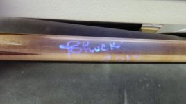
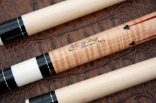
I find a poorly executed signatures takes away from the final product. Have seen stunning cues with chicken scratch signatures. Why go through all that trouble and then flake out at the end?
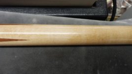
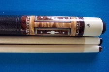
Many high quality cuebuilders seem to have nailed a good lookin signature or logo. Seems to add a higher level of quality to the build.
Agree-disagree? Thoughts? Favorites?
Many high quality cuebuilders seem to have nailed a good lookin signature or logo. Seems to add a higher level of quality to the build.
Agree-disagree? Thoughts? Favorites?
")