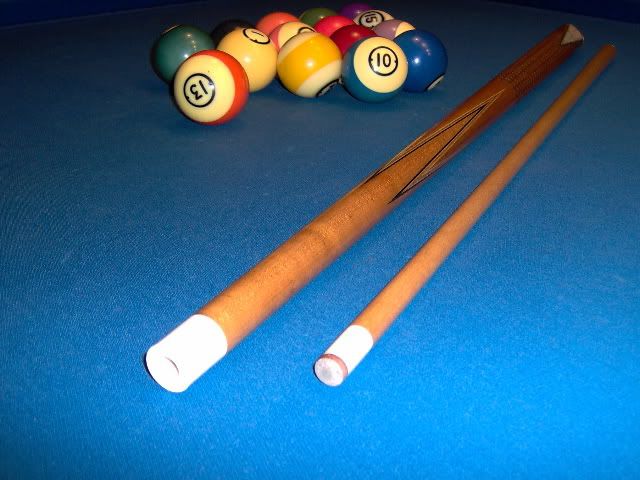
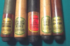
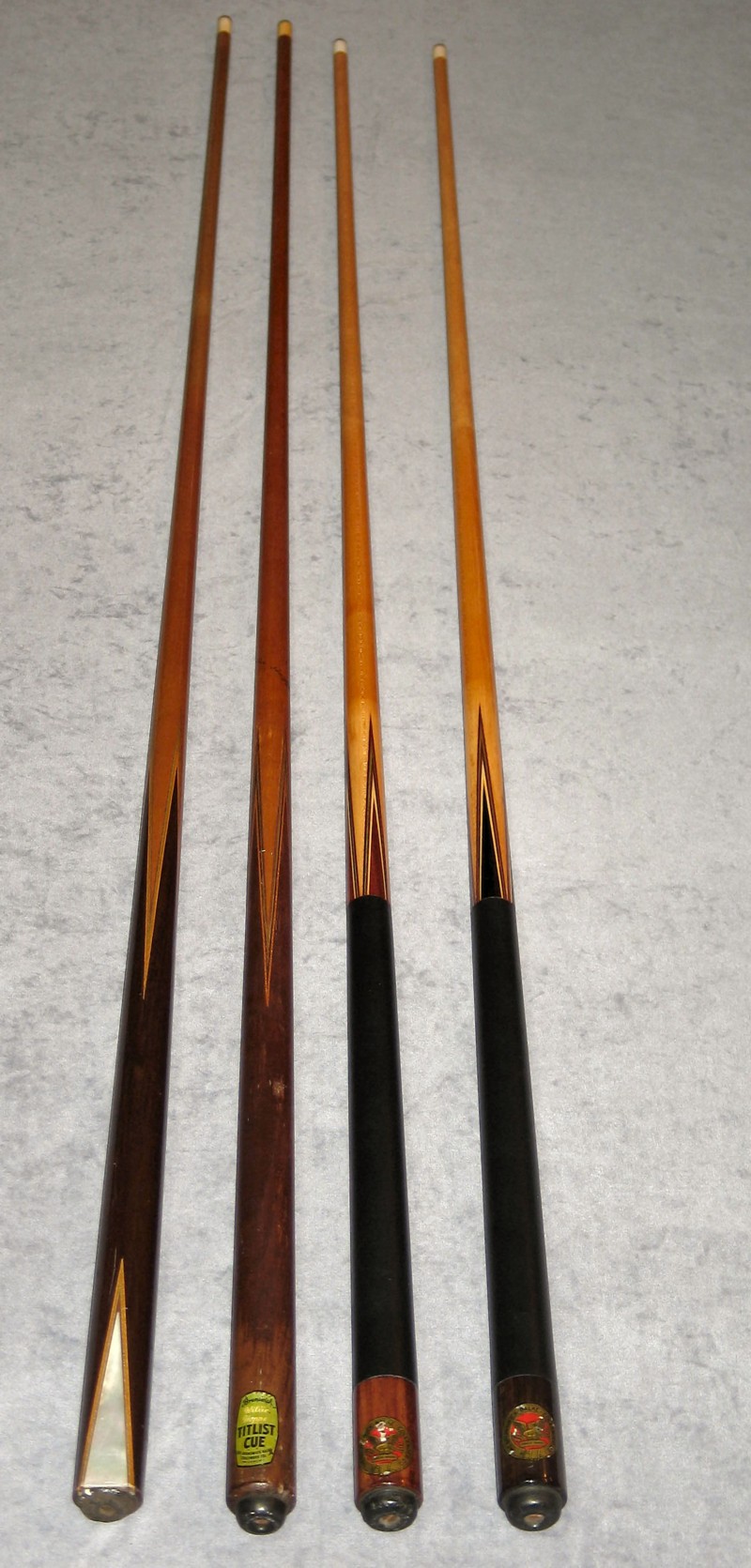
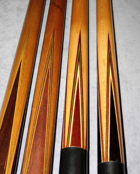
I am posting this to show the evolution of the Brunswick Willie Hoppe Titlist, from it's earliest beginnings.
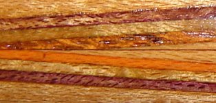
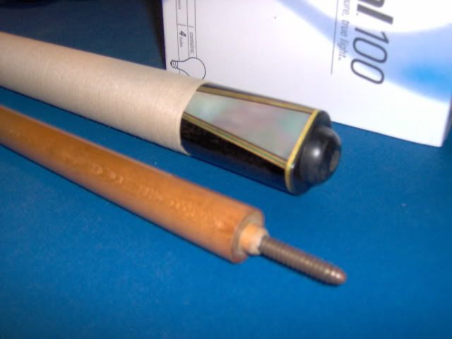
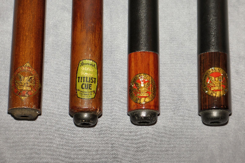
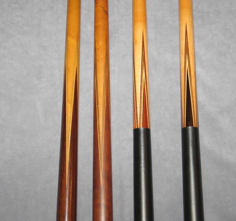
The first cue on the far left is a Model 26 1/2 with mother of pearl wedge and early BBC decal. The early decals were clear between the BBC text and the eagle. This cue was made somewhere around 1910 - 1915 and shows the veneer treatment that would eventually become the Titlist. Note the veneer colors are purple, light green, purple, natutral. The veneers are thin.
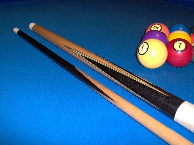
The second cue is an early Willie Hoppe Titlist. This is probably one of the earliest, early 1940's. Note the sharp inner points. The veneer colors are purple, green, purple, natural. The early cues did not have the blue we have become accustomed to.
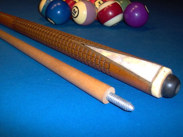
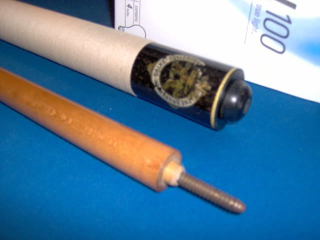
The next two cues are Bruswick 26 1/2's including a rarer ebony cue. These BBC decals are from the early 1920's and have a solid red between the eagle and the BBC. both of these cues have the same veneer colors as the early Titlist.
At some point, I would say late 1940's to early 1950's, the green became blue, which is the color we are used to seeing. Later, the colors became even more vivid.
Chris
The first cue on the far left is a Model 26 1/2 with mother of pearl wedge and early BBC decal. The early decals were clear between the BBC text and the eagle. This cue was made somewhere around 1910 - 1915 and shows the veneer treatment that would eventually become the Titlist. Note the veneer colors are purple, light green, purple, natutral. The veneers are thin.
The second cue is an early Willie Hoppe Titlist. This is probably one of the earliest, early 1940's. Note the sharp inner points. The veneer colors are purple, green, purple, natural. The early cues did not have the blue we have become accustomed to.
The next two cues are Bruswick 26 1/2's including a rarer ebony cue. These BBC decals are from the early 1920's and have a solid red between the eagle and the BBC. both of these cues have the same veneer colors as the early Titlist.
At some point, I would say late 1940's to early 1950's, the green became blue, which is the color we are used to seeing. Later, the colors became even more vivid.
Chris