Graphic Artist Needed

MikeJanis

Banned
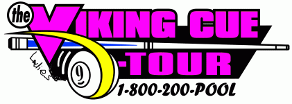
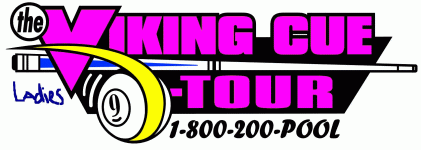
I need help with re-creating our logo (s).

Can anyone her on AZ help.

When you see what I did to the logo below you will understand why I need help.


Contact: Mike Janis at vikingladiestour@yahoo.com or through the info in my sig line.

Thanks, Mj
 

Attachments

  • V-Ladies.GIF
    V-Ladies.GIF
    83.6 KB · Views: 386
I’ll give it a try later tonight, after work. I’m not a professional graphic artist though.

What is most important? Does it need all the components in your example – like the 9-ball swoosh, colors, cue stick and /or the word Ladies to appear. Does it need to be consistent with your other logos? Or, would you consider something else, possibly with more artist freedom?

Rick
 
Last edited:
I like the first logo you did, better Steve. REP for you.
JoeyA
 
Thanks. I actually think the whole thing should be re-done... and without pink. But that's just me!


JoeyA said:
I like the first logo you did, better Steve. REP for you.
JoeyA
 
Great job steve, I like your redesign better than the actual logo.

I think Mike should go with a version of your redesign for the main tour also.
 
Well if he goes with a re-design, he should do an overhaul. The logo looks dated. Maybe it's just me and my simple/clean aesthetic sense, but something like this I like better. It's nothing fancy because I still have work in the office to do. It'd need a few more graphic elements, but something like:

[edit: wow, I must be bored at work today]

vikingbanner3.jpg


mthornto said:
Great job steve, I like your redesign better than the actual logo.

I think Mike should go with a version of your redesign for the main tour also.
 
Last edited:
On the last one, I think you want the 9-Ball in between ladies and tour probably centered.

I think it's customary to say Ladies 9-Ball Tour instead of 9-Ball Ladies Tour.
 
You're right.

D'oh!

Better?

vikingbanner6.jpg


crosseyedjoe said:
On the last one, I think you want the 9-Ball in between ladies and tour probably centered.

I think it's customary to say Ladies 9-Ball Tour instead of 9-Ball Ladies Tour.
 
Last edited:
Hi Steve:

Great job on the logo. I have a suggestions though.. You might want to avoid blocky text and add some feminine touches... Here are some clip art files I pull off from my collection..

However, I couldn't ever make them happy no matter what I did for them... :o :o :o

Women hate having men speaking for them.
On the other hand, most taylors are men.
 

Attachments

  • Picture 15.png
    Picture 15.png
    17.4 KB · Views: 153
  • Picture 14.png
    Picture 14.png
    24.8 KB · Views: 123
  • Picture 11.png
    Picture 11.png
    56.4 KB · Views: 128
  • Picture 10.png
    Picture 10.png
    70 KB · Views: 131
Last edited:
Boy, everyone's a critic! Just kidding =)

I just tried to keep the same font style of the original, but without being as 1980s blocky. I'd have used a newer more feminine font myself... something like ITC Legacy Sans Book.

cuetable said:
Hi Steve:

Great job on the logo. I have a suggestions though.. You might want to avoid blocky text and add some feminine touches... Here are some clip art files I pull off from my collection..

However, I couldn't ever make them happy no matter what I did for them... :o :o :o

Women hate having men speaking for them.
On the other hand, most taylors are men.
 
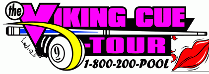
Something more like this with a lighter shade of pink ?

A rose or those Lips incorporated wouldn't be bad either.


With the words like this we could also use it for the OPEN tour and the AMATEUR tour.

Mj
 

Attachments

  • V-Ladies.GIF
    V-Ladies.GIF
    41 KB · Views: 255
One more since I'm bored. I should say I think these look cheesy, but I've got nothing else to do before dinner.

vikingbanner11.jpg
 
crosseyedjoe said:
I think it's customary to say Ladies 9-Ball Tour instead of 9-Ball Ladies Tour.

This is true in general. However, "9-Ball" in here is represented in graphic and it doesn't read as "9-Ball" which adds a flow block in the middle of sentence: Viking > Ladies > LOGO > Tour.

Imho Steve had the right idea of having "Ladies Tour" together. If you can have Viking Ladies Tour all under the same font, it will be very readable.

In any case, spell out "9-Ball" and put Ladies 9-Ball Tour underneath Viking. Stick a pretty rose somewhere to soften the blocky look.

I just had an iad, why dont we use Mike's original triangle logo to start: replace "9-Ball Tour" with "Ladies 9-Ball Tour" in the same yellow color and put a rose or a kiss on the 9 ball logo. The texts are very blocky some we got to find a really pretty rose or a juicy kiss. We can also play around with switching colors...

avatar126_4.gif


Got to go back to work...
 
Last edited:
StevenPWaldon said:
One more since I'm bored. I should say I think these look cheesy, but I've got nothing else to do before dinner.

You're a versatile guy, but I still like your instincts - the first one was best.
 
Back
Top