You are using an out of date browser. It may not display this or other websites correctly.
You should upgrade or use an alternative browser.
You should upgrade or use an alternative browser.
Pool Ball Collecting.
- Thread starter Rubik's Cube
- Start date
Hard Knock Cues
Well-known member
Looks like the millenniums have a white ring around the black that the numbers are in.Can someone educate me on Meucci Pool Balls? What the difference between the Millennium Set and the Professional Tournament Player's Set?
I assume they are both desirable?Looks like the millenniums have a white ring around the black that the numbers are in.
Hard Knock Cues
Well-known member
I believe so, I'd like to get my hands on a set of each.I assume they are both desirable?
My first shelfie!
Got a delivery today from IKEA. All the stuff around needs to be finished, but I wanted to put up the shelf first and fill it up. So just imagine not seeing the carpet and all the things around.
That’s my treasure so far! Nothing too special maybe, but all I need for my games and now I can find sets easier

Not much space left, so I will be more picky in the future with my additions. Or try to replace cheaper Chinese sets with good quality Aramith (or other brands).
Got a delivery today from IKEA. All the stuff around needs to be finished, but I wanted to put up the shelf first and fill it up. So just imagine not seeing the carpet and all the things around.
That’s my treasure so far! Nothing too special maybe, but all I need for my games and now I can find sets easier
Not much space left, so I will be more picky in the future with my additions. Or try to replace cheaper Chinese sets with good quality Aramith (or other brands).
sudocrushms
Well-known member
IKEA storage for the win! Simple, practical, and inexpensive.My first shelfie!
Got a delivery today from IKEA. All the stuff around needs to be finished, but I wanted to put up the shelf first and fill it up. So just imagine not seeing the carpet and all the things around.
That’s my treasure so far! Nothing too special maybe, but all I need for my games and now I can find sets easier
View attachment 918701
Not much space left, so I will be more picky in the future with my additions. Or try to replace cheaper Chinese sets with good quality Aramith (or other brands).
Love all the sets of carrom balls.
I wanted enough balls to play Blackball or Cutthroat with them, hence the huge amount. And I managed to get a few boxes for 7,- only in used but flawless condition. So I had to grab them. They tend to be quite cheap if one can wait for a deal, and none of them I paid more then 20,- for
I bought the Billy shelf, because this is my library and it should match the room furniture. I am a collector of SF books as well

The black board is my Keno board in progress. Did not have time to finish it so far. I am currently in the process of drilling the holes
I bought the Billy shelf, because this is my library and it should match the room furniture. I am a collector of SF books as well
The black board is my Keno board in progress. Did not have time to finish it so far. I am currently in the process of drilling the holes
Hard Knock Cues
Well-known member
Good start, I had a space too, then found another space, and more spaces.My first shelfie!
Got a delivery today from IKEA. All the stuff around needs to be finished, but I wanted to put up the shelf first and fill it up. So just imagine not seeing the carpet and all the things around.
That’s my treasure so far! Nothing too special maybe, but all I need for my games and now I can find sets easier
View attachment 918701
Not much space left, so I will be more picky in the future with my additions. Or try to replace cheaper Chinese sets with good quality Aramith (or other brands).

I too am rethinking my collection and not letting it go too wild. I'm trying to focus on more quality and less quantity these days. Trading out lesser sets for better ones is some of the fun, especially when you find a great deal on a better set.
I am finally adding the bocetta balls. Picked up these new sets, One for a friend. The other two for me to keep. one unused for the collection and one to play with.
So I am ready for some of the rules and games to play with them if you don't mind sharing Mulambo. I grew up playing bocce, The game you play outside on the ground. I would imagine it's pretty much the same as that.
where did you get these? been wanting to add a set to my collection for some timeGood start, I had a space too, then found another space, and more spaces.
I too am rethinking my collection and not letting it go too wild. I'm trying to focus on more quality and less quantity these days. Trading out lesser sets for better ones is some of the fun, especially when you find a great deal on a better set.
View attachment 918862
I am finally adding the bocetta balls. Picked up these new sets, One for a friend. The other two for me to keep. one unused for the collection and one to play with.
So I am ready for some of the rules and games to play with them if you don't mind sharing Mulambo. I grew up playing bocce, The game you play outside on the ground. I would imagine it's pretty much the same as that.
e
Hard Knock Cues
Well-known member
It took me awhile to get them from my Aramith distributor. They were on backorder for almost a year. There's a chance I can get some more but reselling them will not be cheap.where did you get these? been wanting to add a set to my collection for some time
e
Yes, nearly the same.So I am ready for some of the rules and games to play with them if you don't mind sharing Mulambo. I grew up playing bocce, The game you play outside on the ground. I would imagine it's pretty much the same as that.
I need to get more serious with my efforts of putting my rules website online. I will have to check for a domain and a server provider
Lets2billiards
Member
Hard Knock Cues
Well-known member
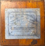
Nice box, how about a picture of the balls?A bit off topic, but here is a new acquisition. Balls w/i seemed mixed and don't know about deciphering them, but I do like the box from 1905!
Hard Knock Cues
Well-known member
I have Italian ancestry so during family picnics we always played bocce growing up. I'll be giving them a try tonight.Yes, nearly the same.
I need to get more serious with my efforts of putting my rules website online. I will have to check for a domain and a server provider
I'm looking forward to your website. I've used a site called namecheap for a domain and it only cost a few bucks a year to keep it.
I might be able to do it on our company server, so I only have to register a domain. I have a name, but it is quite long, so I am not sure if it is a good idea. But all the good short ones are taken, and I want it to be descriptive as well.I have Italian ancestry so during family picnics we always played bocce growing up. I'll be giving them a try tonight.
I'm looking forward to your website. I've used a site called namecheap for a domain and it only cost a few bucks a year to keep it.
So my idea so far was:
Billiard Games Library
Not sure if this might be too long for people to remember, but I think it is an easy name
