Cloth Color Question

iacas

Drill Sergeant
Silver Member
In about two weeks, I'll take delivery of the table listed in my signature. The pool room I'm building will be done by then. It has kneewalls, a slanted ceiling (the roofline over my garage, basically), measures 22 x 18', and has plenty of 50w halogen lights (14, six of which are for the table).

My plan is to paint the walls "billiard room green" (the actual name of the paint color, kid you not). It's a darker green, perhaps a tad lighter than a forest green... Our flooring will be a 5'x9' blue/green/tan sunk-in carpet with wood laminate flooring. The flooring - and the finish on the table - closely match the rest of the wood in my house. So, they match each other pretty reasonably. I am getting Simonis 860 cloth.

I have a few days left to decide on the color of the cloth. I originally chose "Spruce" because the person I talked with said it "lightens considerably under light." Admittedly, my office light is not nearly as bright as the pool room lights will be, but it seems quite dark to me.

I'm considering other colors, like Camel or Dark Green. The Marine Blue seems too dark and Electric Blue seems like it'd stick out like a sore thumb.

If you were me, which color would you choose? Why? I appreciate all responses... but if you could, please avoid saying "get what you think you would like in the end!" or similar things. Obviously I'll get what I like most in the end, but the opinions (and reasons) of others matter to me (at least a little) because they've been there, done that and have valuable opinions on what would look good.

My concerns, for what they're worth:
1) Camel - will it blend in to the table (wood) a little?
2) Spruce - is it too dark?
3) Dark Green - The fact that the guy at the store said most people when deciding between dark green and spruce go with spruce.
4) All other colors - don't match anything in the room
 
iacas said:
If you were me, which color would you choose? Why?

I would choose the blue that the folks at Diamond Billiard and the Pantone group came up with as the color that shows the balls the best (to the person's eyes). It has become the standard cloth used in all Diamond table events.

Fred
 
Cornerman said:
I would choose the blue that the folks at Diamond Billiard and the Pantone group came up with as the color that shows the balls the best (to the person's eyes). It has become the standard cloth used in all Diamond table events.

Fred
I agree. I played on green cloth since I was a teenager, and playing on the tournament blue at the Derby was easier on my eyes.
 
Last edited:
I would choose the tradional green (Simonis 760 or 860) as I'm a traditional kind of guy. I find blue, red and black to be a little too obnoxious. With the green, I can focus on the balls and not even notice the cloth color, but when I visit a poolhall with an unusual color, it agitates me. Most tables at the poolhalls in my area have traditional green cloth, so I say go with what you spend the most time on, (while at home and away).
 
Last edited:
I guess the spruce, whatever the normal green color is. Bluw is nice to, but I prefer green.
 
Nico said:
I would choose the tradional green (Spruce?) as I'm a traditional kind of guy. I find blue, red and black to be a little too obnoxious. With the green, I can focus on the balls and not even notice the cloth color, but when I visit a poolhall with an unusual color, it agitates me. Most tables at the poolhalls in my area have traditional green cloth, so I say go with what you spend the most time on, (while at home and away).

I like the traditional green cloth on a Pool Table. I too was at the Derby City Classic & played on the tables... it was OK, but I'm a traditionalist too. The traditional green cloth goes well with any color decor. I prefer the Simonis 860
 
Just a few quick notes...

1) the Spruce is a dark, dark green. The more traditional green is probably "Simonis Green." Then they also have "Blue Green" and "Dark Green." The Spruce is even darker than that. So, Nico, even the spruce isn't really "traditional green."

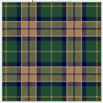
2) Blue won't match anything in the room. The carpet (a plaid pattern) has dark green (roughly matches the walls), a camel-like color brown, and a navy blue. Powder Blue and Electric blue match nothing. Maybe that's okay, maybe it's not.

BTW, I should have included this link: Simonis Cloth Colors.

P.S. Here's the carpet (attached).
 

Attachments

  • carpet.png
    carpet.png
    37.4 KB · Views: 536
Last edited:
I got too dark a green and intend to go back to a regular green. careful on the darker shdes, they look great in the store but aren't as good to play on IMO. the best non green for function is camel type color - I played at a poolhall a while back that still had some tables with the brunswick gold that may have been popular in the '60's. It is easy on the eyes, and the gold master chalk doesn't stain shafts. The main drawback is that it is not green and pool tables are green. Get green, but regular IMO
 
Out of the colors you listed, I would think that the traditional green would probably be your best choice to fit in the room. Overall I would be worried about how dark the room will be, but you do have a lot of lights in there.

The tables that I have played with lighter cloth (light grey, camel, etc) just seem to look dirty really quickly. Chalk marks stand out like a sore thumb (unless you are willing to use a matching chalk). I would avoid those.

My personal favorite for a color to play on is pretty much the Electric Blue on the Olhausen site. There just seems to be more contrast to the balls or something. Maybe it reflects more light. Of course, my taste is probably radically different because if I had the time/money/space I would put in a graphite finish Olhausen Waterfall, with faux mother of pearl sights and the electric blue cloth. :)
 
i grew up on green and i think it looks the best on a table..........but i played a couple weeks ago on some diamonds with that lite blue and it did seem like everything was easier to see. I dont think it looks very nice, it might in the right room, it would probably look like crap with the colors you have but it sure was easy on the eyes as far as pocketing balls
 
I have a mahogany table with camel felt.
I think the camel and the color of the table go great together, the color is great under the light. the chalk blends in very well.
I also feel the color give the table a "classic" look.
 
Thanks for the opinions thus far stated. I appreciate 'em.

One additional note: the amount of "green" on the walls is actually quite small. As stated, there are knee walls and they measure 3.5 and 4 feet in height, so the green on those walls is pretty small. On the larger walls (the ends of the room), they've got a window and a door to break up the color(s).

So, still not entirely sure which way I'm going to go. Keep the opinions coming. :-)
 
Cornerman said:
I would choose the blue that the folks at Diamond Billiard and the Pantone group came up with as the color that shows the balls the best (to the person's eyes). It has become the standard cloth used in all Diamond table events.

Fred
I agree with Fred.

After I played a match on the blue cloth at the Derby, I liked it much better than the traditional green. The blue seemed to light the table up better, and I could see the balls much more clearly. I don't think it was my mind either. I think the blue lights the table up better.

Mike
 
My table is over 100 years old so I went with the traditional green. After many recoverings I decided to go with the dark green because it keeps its luster much longer and I am glad I did.

I overheard Buddy Hall and Earl Strickland at the DCC talking about the new blue and they both said they liked it better because they can see the edge of the balls clearer. I agree with that but if you have really good lighting to go with (hopefully) young eyes I would go with green for this major reason:

Some of the chalk made for different color tables does not seem to be as good as the traditional Masters green.

I have also read where Willie Mosconi liked the camel color better because he could see the balls better, but that was long ago and it may have been promotional inspired. I always hated to see green chalk marks on the camel cloth.
 
I have a table in that finish in my showroom with the camel felt and it looks awesome. Too many darn people are going with spruce or dark green these days. So that would be my first choice. the blue is nice as well but I don't like it personally with that color table
 
NineBallNut said:
I have a table in that finish in my showroom with the camel felt and it looks awesome. Too many darn people are going with spruce or dark green these days. So that would be my first choice. the blue is nice as well but I don't like it personally with that color table
You have camel with the american walnut finish on Oak? It doesn't look funny? Do you have a picture? Do you use only tan colored chalk?
 
Back
Top