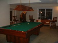
Cloth Color Question

I'm with him...

Secaucus Fats said:
I like the traditional Simonis Green. The spruce seems too dark.

I'm with SF, the traditional Green would probably
bring your colors together for the room better.
 
I'll add that the darker colors like marine blue and spruce will show more burn marks and other debris like chalk and dust bunnies. I've questioned many wood/cloth combinations when I get a work order, but alot of the time people make it work with the colors in the room. Camel with matching chalk or Tournament Blue with blue chalk would probally look the best over time.
 
Last edited:
no, we have a darker finish. The lighter finish would blend with the felt and may look awkward.. everyone has there own preference. I had to look at a picture of the table on the net and it was pretty dark. That's the only reason I said that. Go with the dark green or blue. I have installed many tables however with tan felt on oak finish. I have never agreed with it but hey, got to give the people what they want......lol
 
mechanic/player said:
I'll add that the darker colors like marine blue and spruce will show more burn marks and other debris like chalk and dust bunnies. I've questioned many wood/cloth combinations when I get a work order, but alot of the time people make it work with the colors in the room. Camel with matching chalk or Tournament Blue with blue chalk would probally look the best over time.
Those are the colors I have the most concern with: the blue won't match anything and the camel might blend in too much. Hrm.

Thanks, though. I guess Spruce is pretty much out... nobody seems to recommend it.
 
Got my table back together after the flood and the regular green looks better than the darker green I had. I am using championship 3030 not simonis, but my guess is that the shades are approximately the same. Darker cloth is really a light eater. Regular green better IMO.
 
cloth color

Well, I'm NOT an interior designer, and I want that to be clear. However, you've got green on the walls, and green in the plaid on the carpet. One of the things about green is that you can put 2 shades / tones together & it'll almost always look OK, but a 3rd can look pretty bad. As Marissa noted earlier, that's a lot of green.

So, you could get a green cloth for the table, and worst case, repaint the walls if you don't like it (figuring that's cheaper than redoing the table), spend the money to hire an interior designer upfront - they wouldn't probably charge too awfully much for color coordination, or

I'd go for the camel colored cloth for a home table. First, its as neutral as you can get, except maybe gray. Second, you've got a camel color in that plaid carpet, so its going to fit, and keep the color scheme together. Third, it looks good with any wood. Fourth, it won't be soaking up the limited light in the room. Finally, you can get matching chalk easily which has two benefits - it won't show on your hands (or your guests' hands) nearly so much as blue does, and it also won't show on your cue ferrules & shafts (your 'house' cues) - and you know you're going to get some chalk grinders playing on that table sooner or later.

If you're worried about the camel & whatever color wood (lighter woods would be 'blended' with less contrast, then try a few of the table mfg sites, on some of them you can "build your own table" so you can see the cloth color on the table wood you choose.

So while I like Lora_Ann's scheme earlier in this thread, just take her carpet and put it on the table, and her table cloth and make it the carpet! You're on your own regarding the wainscotting!
my $.02
 
Last edited:
I work on tables and I have done so many colors it'll make your head spin. We have I think 40+ colors to choose from with our standard cloth. I've done Hunter Orange on a Traditional Maple table. We do a lot of Georgia Tech and University of Georgia clothes. Where we 2 tone it. Say for UGA we'll do a black bed with Red Rails. Or opposite. We even embroider the rails which people love.

We have Hot Pink cloth but have yet to take that one out.

My boss and I always get asked "What do you think will look better". We tell them it's personel preference and kind of dance around outright answering the question. Because we know what looks good. But people will want us to do ugly stuff. We're just paid to put cloth down.

Our shop recieved a catalog of these felt designs that is actually on the playing surface. And is suppose to be decent cloth. I saw Mossy Oak camoflouge. A fire. A street with burnout marks. And one I would dred doing was a hardwood floor. I don't know how we could stretch the flooring straight. If you can you are one awesome mechanic.
 
I have camel on mine and my dad has camel on his, which I played on for 20 years. for a home table i like it a lot more than green or blue. i have the simonis 860.
 

Attachments

  • IMG_1713.jpg
    IMG_1713.jpg
    64 KB · Views: 191
Simonis 300 in Simonis Green or Tournament Blue, or Granito M in Yellow Green or Ultramarine.

I prefer blue for playing, I also wouldn't care about mathing my cloth to my room (if I were so lucky), but if asthetics had weight, then I would go with the regular green, not the dark stuff. Tan is right out!

The most important part for me though, is the speed. The faster the better, but the cloth I listed would not last a week on a bar box. It's made for carom tables. You would definitely need to pamper it.
 
Cardinal2B said:
Third, it looks good with any wood. Fourth, it won't be soaking up the limited light in the room.
The room doesn't have limited lights. It has 14 50w halogen lights - about four to six more than would normally be required or necessary.

Cardinal2B said:
If you're worried about the camel & whatever color wood (lighter woods would be 'blended' with less contrast, then try a few of the table mfg sites, on some of them you can "build your own table" so you can see the cloth color on the table wood you choose.
I've done that. See the table ID in my signature?

smittie said:
Our shop recieved a catalog of these felt designs that is actually on the playing surface. And is suppose to be decent cloth. I saw Mossy Oak camoflouge.
It's standard old Simonis 860. I'm not looking to do something stupid. :) :)

Dangit this sucks. I know, everyone should have this problem, but I don't want to make the wrong decision. I think the "Electric Blue" would look funny, but then some people say "don't match it to the room." Camel might look great but then again, might blend into the wood a bit too much. And Spruce matches the room great but will lead to more visible burn marks and/or a really dark cloth.

Given all of the above, the standard Simonis 860 green seems like it might be the best option. But I have another day or two to think about it...
 
iacas said:
The room doesn't have limited lights. It has 14 50w halogen lights - about four to six more than would normally be required or necessary....

sorry, missed that.

iacas said:
I've done that. [looked at build your own table] See the table ID in my signature?
....
missed that, too

iacas said:
It's standard old Simonis 860. I'm not looking to do something stupid. :) :)
....
can't go wrong there.

iacas said:
Dangit this sucks. I know, everyone should have this problem, but I don't want to make the wrong decision.
....
Nah, treat it like fun. It's supposed to be.

iacas said:
Camel might look great but then again, might blend into the wood a bit too much. ....
I looked at your table on the Olhausen site, and think that unless you'd like to change the wood to a darker color, like the Professor's mahogany pictured earlier in the thread, then you're right, there's not much contrast between the wood and the camel cloth. It would be OK, but not very dramatic.

iacas said:
Given all of the above, the standard Simonis 860 green seems like it might be the best option. But I have another day or two to think about it...
decisions, decisions! That table looks good with std green...if it doesn't work out for the total look, you could paint the walls camel color (to pick up the camel from the carpet).

Best of luck with this, post us a pic when its all done.
 
I did myable in spruce and painted the walls that dark green you mentioned. It looks really great! You should be prepared to paint the walls with many coats of paint (it took nine coats for my project). Very dark paint colors like that are more transparent and therefore take more coats. I know it seems odd but that's the way it is.
 
pawnmon said:
I did myable in spruce and painted the walls that dark green you mentioned. It looks really great! You should be prepared to paint the walls with many coats of paint (it took nine coats for my project). Very dark paint colors like that are more transparent and therefore take more coats. I know it seems odd but that's the way it is.
I emailed the dealer and gave him my final decision: standard Simonis 860 green. If he misses the message and it comes in Spruce, I probably won't complain.

It's new (on drywall), so I got some drywall primer and enough paint for two to three coats. It's a thicker paint (semi-gloss, I think), so it should be okay...

My main concern with the color wasn't necessarily matching, but also about playability. The spruce just didn't seem as playable as the standard tournament green... though the 6 ball blends in with the tournament green far more than it ever would into Spruce... :)

I decided against camel because of the "blending" concerns. And the electric blue would have stuck out like a sore thumb.
 
iacas said:
I emailed the dealer and gave him my final decision: standard Simonis 860 green.

You made the right decision. I first had Spruce on my Olhausen, and it was too difficult to see the balls clearly, particularly when near the rails. It just didn't get enough illumination as it was so dark. This is my table now with traditional Simonis 860.
 

Attachments

  • OlhausenTraditional.JPG
    OlhausenTraditional.JPG
    20.5 KB · Views: 224
I have heard in the past that one of the reasons green should be used is that it is less harsh on the eyes that most other colors. I don't know if it is true because that is virtually the only color I regularly play on. I did play a guy about 25 years ago that had pink! I couldn't hit a ball on the table. I think that's why he chose it. It gave him at least a mental advantage in the game.
 
cuenut said:
I have heard in the past that one of the reasons green should be used is that it is less harsh on the eyes that most other colors. I don't know if it is true because that is virtually the only color I regularly play on. I did play a guy about 25 years ago that had pink! I couldn't hit a ball on the table. I think that's why he chose it. It gave him at least a mental advantage in the game.
The human eye responds very well to green, but red light and blue colors are the "easiest" on the eyes. Red light is used in dark rooms and some dashboards (like in most Pontiacs), with blue right behind it (a lot of dashboards). The human eye tends to perceive green as being a little more saturated than it is.

Or something like that...
 
My wife talked me into getting this color. I really didn't mind since she paid for the table. When it wears out, I'm going to get Grey Simonis cloth. This color is called Olive. It's really not that bad. I use standard blue chalk. I've tried other color chalks and blue shows up the least.
 

Attachments

  • Pool Room.JPG
    Pool Room.JPG
    80.7 KB · Views: 208
Last edited:
This is a no brainer -

Standard green! If it aint broke, don't fix it :)

Why? You ask... I like to keep things the same. I think it is an advantage to have home equiptment that resembles your competition equiptment as close as possible. When I'm playing for "keeps", I want my subconscience mind to feel at home. I know that may sound strange, to some, but I want every possible advantage I can afford myself. Afterall, everybody shoots sporty, nowadays, so I need all the help I can get... Even if it may not help at all ;)


The real question to ask yourself is -

How can I build a billiard room without standard green cloth? It just can't be done...

edit - I just realized you already made your purchase! I should read the whole thread before I reply, eh? Great choice, BTW. Simonis Green is what I've been using for years. Might change to IPT cloth, though...
 
Last edited:
i have the blue on my table, green on another, and red and i have to say the blue is easier for the eyes and my favorite color.
 
Back
Top