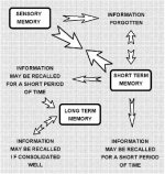
These are just the effects from your body movement, so the diagram doesn't include equipment effects like type of tip, shaft deflection, cleanliness of ball, etc.
Last edited:
Great graphic! I tried to spot an obvious error but don't see any. You are obviously adept at PowerPoint.
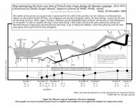
If you are a student of how to clearly convey detailed information in a concise format, check out Minard's graphic of Napoleon's invasion and retreat from Russia in 1813:
From Wikipedia: "It displays six types of data in two dimensions: the number of Napoleon's troops; the distance traveled; temperature; latitude and longitude; direction of travel; and location relative to specific dates."
These are just the effects from your body movement, so the diagram doesn't include equipment effects like type of tip, shaft deflection, cleanliness of ball, etc.
I'm pretty sure that learning to play billiards well is far harder than invading Russia (even during the winter), and I wonder if the two graphics can be combined in such a way to show that.:wink: