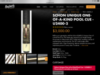
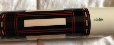
That logo is awful, grotesque, hideous & Schon should eliminate it. Just stick with what works and don’t try to reinvent.This is the logo on a brand new cue, out of their shop, that is currently for sale. It’s obvious the quality standard is nowhere near the Runde or Clarke eras It looks like a child did it. Sad
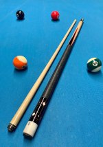
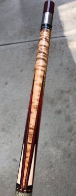
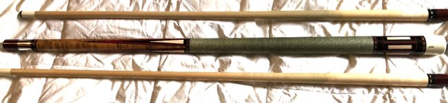
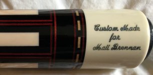
p.s. The cue in the photo is a closet queen built in 1984. I switched from steel to playing ivory joints 15 years ago. But it
does have a unusual provenance and if Bob Runde sees this, he’ll recall what a nightmare my cue order became but
ultimately in the long run, Bob and I became close acquaintances. I wish I had ordered a Runde cue made after he left.
Attachments
Last edited: