You are using an out of date browser. It may not display this or other websites correctly.
You should upgrade or use an alternative browser.
You should upgrade or use an alternative browser.
Willie Hoppe Cue
- Thread starter firesteel
- Start date
takeitdown
Banned
I am wondering the same thing, what do the rest of you guys think about the script on the forearm?
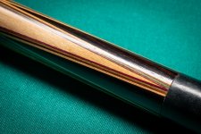
I am no expert, but the finish over the Hoppe logo and that script looks to be nice and shiny, more so than the rest of the cue perhaps? Also the script itself looks to be very dark and almost perfect, unlike most other examples of Herman's work (can't remember the name of who did the "pretty" script). In any case it us certainly a very cool classic cue! Curious to hear what the experts think! -Josh
I have read that having the calligraphy name does not mean Rambow ever touched a cue. There was at least one person at Brunswick personalizing cues like this before it became a common practice on Rambow custom cues.
This one is a real beauty. Very nice .
takeitdown
Banned
I'm not an expert at all of these, but y is the joint ring and brass joint different sizes, I do like how the veneers still have very nice color.
You commonly see the black phenolic swollen in these old cues. I am sure when new they were flush.
takeitdown
Banned
I have all the measurements . Here is one of my old Rambo Cues.
The Cue in question appears to be a personalized Hop. See there. Didn't cost $150. The Rambo Cues have a different shape.
judging from your pictures I do not see Rambo..
Nick")

Agreed it is a production cue with the calligraphy personalization. People confuse cues having the owners name scribed with it being a Rambow. This is not so. However Rambow was a supervisor there and oversaw the production of the Brunswick cue line at this time.
Glad I stumbled on this thread. I have one myself.
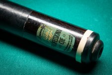
Ebony titlist, with the calligraphy name and initials on the shaft.
The points are longer than I've seen before, all the way to a reverse point. The butt is huge over 1.400".
Overall for its age,very straight.
I had Chad of CAM cues build me two new shafts and it hits great!
...trying to upload pics, but just like when I left this board ten years ago, the picture upload system still "isn't great".