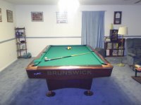
Hard to understand how you think it could be took dark, when you look at Bob's photo of his beautiful antique Brunswick table with Simonis green cloth on it, but I guess everyone sees colors differently. You might consider either Simonis tournament blue or Simonis gold as two excellent options if you're looking for a brighter alternative, but still want a very good color to play on.
The problem is - and this is why I started this thread - is that sometimes Standard Simonis Green looks way different than my samples, or what I had on my table. Look at the pics in BOTH tables. See the difference? The first one is way too dark. The 2nd one looks fine to me, but that's just a pic. And how can that pic look so different from the 1st pic? And how can my sample in the initial post of this thread look so different from the Olhausen video???
Its a crapshoot. So I went with English Green again.