They might as well be snooker balls with no numbers on them. Unless the colors are really eye catching, I think I’ll pass on them.Ain’t very purdy
You are using an out of date browser. It may not display this or other websites correctly.
You should upgrade or use an alternative browser.
You should upgrade or use an alternative browser.
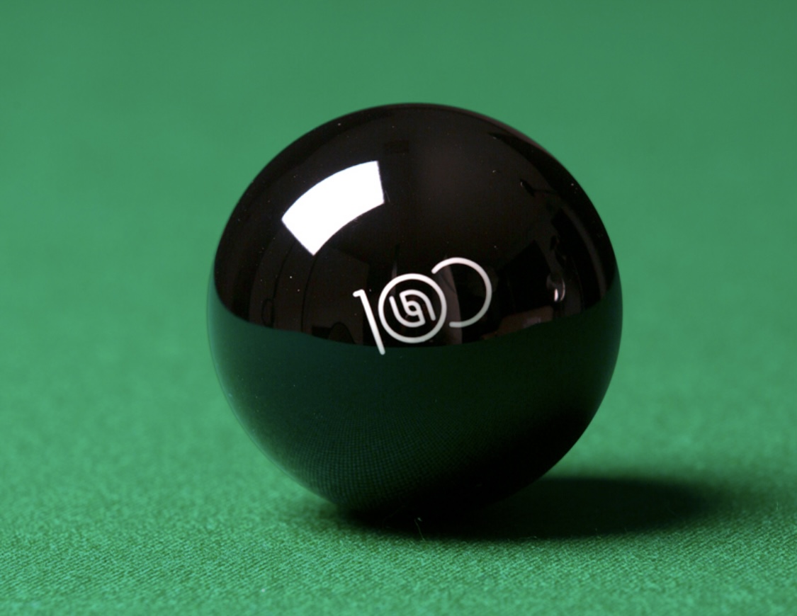
ARAMITH 100 NEW BALL SET
- Thread starter bbb
- Start date
Colors look nice.
I feel like there’s a little bit of form over function. My heart wants the numbers on the balls to be clearly legible. It takes a minor step backward with the logo replacing where the number would be on one side and the numbers on the solid without contrast irks me too.
None of that matters really. I can play just by looking at the colors. I guess I just have a traditional preference on the balls. I’m just hoping to see traditional balls with slightly more vibrant colors.
L.S. Dennis
Well-known member
Not sure who would buy a set of balls that look like that, they sure would never be on my table.
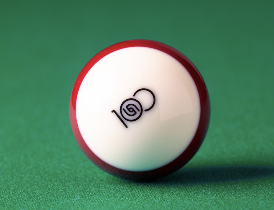
Not having the ball number on two sides is not good. Some people need to be able to read the ball's number to know what ball it is (color-blind people being one such group). The number on one side of a ball is often either not visible at all or difficult to read.I'm not a fan of the 100 logo on the opposite side and the design of the low numbered balls.
If they are truly higher quality than other balls (with their "Duramith Technology" plus improved resin), I imagine they will eventually be used in many events.Not sure who would buy a set of balls that look like that, they sure would never be on my table.
I couldnt find them eitherI couldn't find these photos anywhere in the article. Good job!
thanks for finding the pics

Last edited:
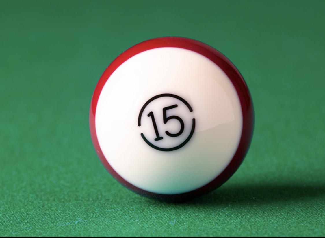
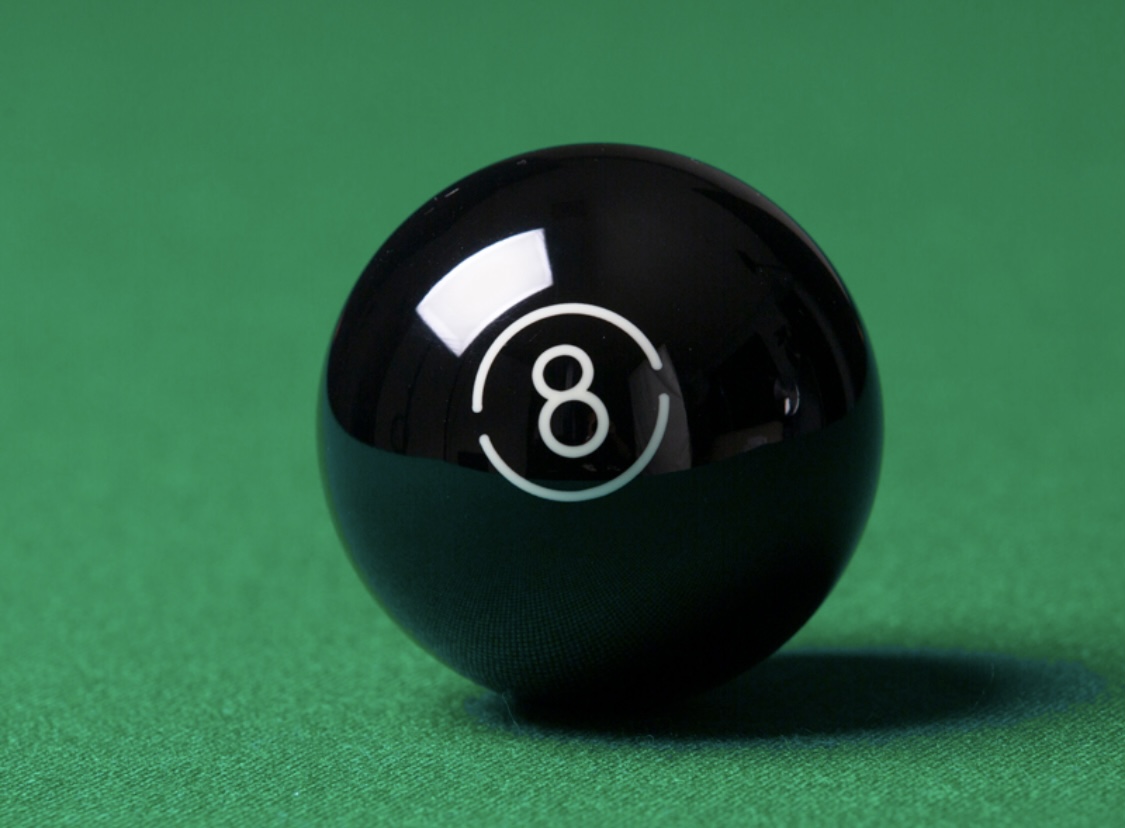
Where do you see the colors? All I’ve seen so far are the 8, 9, 1, 15 and the cue ball.I feel like there’s a little bit of form over function. My heart wants the numbers on the balls to be clearly legible. It takes a minor step backward with the logo replacing where the number would be on one side and the numbers on the solid without contrast irks me too.
None of that matters really. I can play just by looking at the colors. I guess I just have a traditional preference on the balls. I’m just hoping to see traditional balls with slightly more vibrant colors.
I like it a lot! Reminds me of the Tungsten set I got for $65 delivered, which is my favorite set.
") tip of the hat to the private eye scoop,
tip of the hat to the private eye scoop,I was thinking the numbered balls would have had the same warm white/depth/font characteristics as the cue ball presented, a different unique look from the norm for sure, would of for me be tough to focus on.
Instead, the sharp color contrast makes more sense for a serious game.
I'll take a full set of solids and stripes with their One Hundred logo only, for play.
...oh, and the cue ball in the same bright white as the 15 shown but they forget to number and stripe it, I'm good.
however, because of the savings, cost from not numbering and price out in that $65 range, I'll take 4 sets...
Last edited:
Sorry for being misleading. I’ve seen what you’ve seen. Just from what I can tell I like the vibrancy of the yellow and maroon.Where do you see the colors? All I’ve seen so far are the 8, 9, 1, 15 and the cue ball.
...like this?{snip}
...oh, and the cue ball in the same bright white as the 15 shown but they forget to number and stripe it, I'm good.
however, because of the savings, cost from not numbering and price out in that $65 range, I'll take 4 sets...
This white cue ball looks completely different than the yellowish hue cue ball showing on the Aramith website.
That's because I made it the same white at the 15, which he referenced in his post.This white cue ball looks completely different than the yellowish hue cue ball showing on the Aramith website.
I agree with him. They need to make the cue ball white.
no thanks! As much as I hate the black balls, I have to say I would get the black ones over these. That 100 logo is hideous and distracting.
yes, nice touch,
That red striped one looks closer to the 11, for calling it. May be just the photography looking more like their traditional 3, 11 color...
ut oh'.
i
I just want to point something out. A thick vitrification layer is good news. I am doing my own research and I’ll tell you, trying to crack the vitrification layer with a hammer is not easy. If it is 3 times thicker as advertised then these balls will last forever with little wear.
Ill Gotten Gain
Deceased
The Billiard industry need to do focus groups on their products. Seems like companies just make what they want and shove it down our throats until we just accept it.