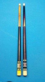
Interesting. I have seen the maple version before I think, but never side by side with the more common version that I can remember.
Interesting to note the shorter butt sleeve and longer points in the curly maple version. Very different proportions.
I think this contributes to the curly maple forearm cue being the more attractive cue to me. It isn't just the wood, it's the proportions as well.
The bigger butt sleeve and shorter points on the dark version make it look butt heavy to me. Though it likely has nothing to do with how it plays it just does not look like it would have as nice of a weight distribution. I admit it is just the appearance.
Says a lot about how varying such design parameters affect the aesthetic appeal of a cue. Especially since so much of the rest of the design is so much the same between the cues.
Very nice.
Thanks for showing off! :thumbup:
.