
opinions wanted

BHQ

we'll miss you
Silver Member
i'm not one to be known for his color coordination skills :rolleyes:
so what do you folks think???
which of these two designs look best

.125" ivorine 4 rings with .015" black fiber on both sides
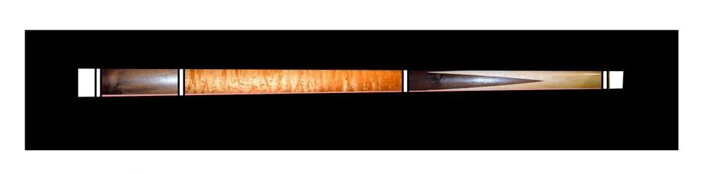
jimlopezdesign.jpg


or replace the white ivorine rings with mahogany linen
keep buttcap and joint ivorine4
jimlopezBdesign.jpg
 
BHQ said:
i'm not one to be known for his color coordination skills :rolleyes:
so what do you folks think???
which of these two designs look best

.125" ivorine 4 rings with .015" black fiber on both sides
jimlopezdesign.jpg


or replace the white ivorine rings with mahogany linen
keep buttcap and joint ivorine4
jimlopezBdesign.jpg


I kinda like the white in this one over the mahogany...go figure. :)

Lisa
 
Opinion

The white rings look better, but the dark wood on it reminds of the old dark wookwork in houses from the 50's, and I don't care for the way the spears are rounded. It has a 'too contrasty' look to it. (except for the handle)
 
I don't think there's really a "right" answer. It's all taste. If the brown rings are very close in color to the darker wood shade it would be OK to my eyes. If not I'd stay away from the brown. The white/black combo really makes the handle area stand out, and that's probably the effect you want with such a beautiful grain. JMO. By the way, any new butterfly work to show off?
Bill
 
billyjack said:
I don't think there's really a "right" answer. It's all taste. If the brown rings are very close in color to the darker wood shade it would be OK to my eyes. If not I'd stay away from the brown. The white/black combo really makes the handle area stand out, and that's probably the effect you want with such a beautiful grain. JMO. By the way, any new butterfly work to show off?
Bill
that was my first inclination also
what do they say??
if it ain't broke, don't fix it ;)
just posted this one today

http://forums.azbilliards.com/showthread.php?t=78664
 
Snapshot9 said:
The white rings look better, but the dark wood on it reminds of the old dark wookwork in houses from the 50's, and I don't care for the way the spears are rounded. It has a 'too contrasty' look to it. (except for the handle)
good eye!!!!
it is a house cue from the 50's, maybe 60's
brunswick
the points are sharp at both ends,
somehow, that gets lost when i'm altering the images to load into the design program
 
Something is not quite right with the points in the forearm. Maybe they are too short or too wide or both.
 
Dawgie said:
Something is not quite right with the points in the forearm. Maybe they are too short or too wide or both.
it's from cropping & altering the sizes of original pictures. the points are right on the actual cue, the pic sucks. ;)
here's the cue
002.jpg
 
Last edited:
Back
Top