Pool T-Shirts and Hats

KRJ

Support UKRAINE
Silver Member
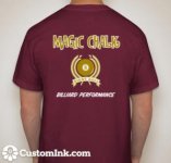
I'm coming out with a line of Magic Chalk T-shirts and hats. They have been designed already.

But, I do have a question for the pool playing public that is AZB.

Do folks prefer the design (this is a full design with name and logo with an 8 ball involved) on the front of the shirt or the back of the shirt?

So, if design goes on the back, the front of the t-shirt would just have a small logo on the left chest.

If full logo on the front, there would be nothing on back of t-shirt.

Any thoughts ??

 
Last edited:
I like logo front. Allows it to still be seen under a jacket or sweatshirt, which is useful this time of year.
 
Full Disclosure: I have no interest in a pool t-shirt. That being said, as a marketing guy, I do like shirts that have a small logo on the chest and a large logo on the back. That way you build brand awareness when coming and going.
 
Here is one of the t-shirt designs :)
 

Attachments

  • MCT (2).jpg
    MCT (2).jpg
    10.2 KB · Views: 506
Love the chalk but the shirt looks cheesy...

Fair enough. Do you not like the 8 ball Logo? I didn't want any skulls, or "funny" bodily part references.

Just the name, in nice print. I added the 8ball so it brings "pool" to the mind about the product.

Is the 8 ball the "cheesy part" ?

Thanks,
 
I think the shirt looks way better than most billiard clothes. I like the central logo, not a fan of the font on the lower text though.
 
Good idea. No skulls etc. Keep it to pool. I like the design on the back. Best of luck with it.
 
Fair enough. Do you not like the 8 ball Logo? I didn't want any skulls, or "funny" bodily part references.

Just the name, in nice print. I added the 8ball so it brings "pool" to the mind about the product.

Is the 8 ball the "cheesy part" ?

Thanks,

No I think it's the font that make it look cheesy and the color choices.... The 8ball design is more than fine... Id rock it but would have to have a different font. The color ought to have options ... Classic white on black as the 8ball is in the game... Maybe a blue with a 10ball logo..just some thoughts
 
I think the shirt looks way better than most billiard clothes. I like the central logo, not a fan of the font on the lower text though.

Yeah, I could not decide what font to use on that one, kept going back and forth. Maybe I will play around with that a little more.

The top text was easy enough, as I tried to "copy" the actual MAGIC CHALK font from the MC box. The MC box uses the color "yellow" for the text, but I thought a more "golden" yellow would look a little better. It's an "old gold".
 
My two cents....it's ok...what I personally would go with would be something stylized and more branded, if you will. I like Black t shirts. I think cursive font looks nice and gives a classic look. And how about a magician pulling a rabbit from a top hat with a wink and a smile. Or a rabbit pulling a piece of chalk from a hat...something along those lines. Again, just an idea. Best of luck! If you use my idea...I'm size xl. Matt D.
 
My two cents....it's ok...what I personally would go with would be something stylized and more branded, if you will. I like Black t shirts. I think cursive font looks nice and gives a classic look. And how about a magician pulling a rabbit from a top hat with a wink and a smile. Or a rabbit pulling a piece of chalk from a hat...something along those lines. Again, just an idea. Best of luck! If you use my idea...I'm size xl. Matt D.

Exactly what I thought when I saw this thread. Black tee with gold cursive writing, logo on
front only though. Top hat with a rabbit pulling a piece of chalk out and under the image

"Magic chalk, its not a trick, it just works."

p.s. a pink tee version for the ladies.....
 
I personally like the large design on the back with a small logo on the front of a dark shirt. The eight ball design is redundant. Everybody knows that it is an eight ball without having to spell it out again, even though you are probably trying to emphasize the game ‘8-ball.’ That design definitely needs to be improved on. The colors need to have a little more pop to them, IMHO. Also the color of the eight should be black, not a different color. The idea of magician pulling out a piece of Magic Chalk from his hat sounds good.
I do use your chalk and fully endorse it. Good luck with the design of your shirt.
 
I prefer a cube of the chalk over the 8 ball with a smaller cube on the left front. sort of a perspective view of the chalk.
 
  • Like
Reactions: KRJ
I prefer a cube of the chalk over the 8 ball with a smaller cube on the left front. sort of a perspective view of the chalk.

I was thinking something similar. Cube of chalk as logo on the front and a plain 8ball or 9ball image with "Magic Chalk" and "Billiard Performance" on the back (matching the font style and color) . 8ball on grey shirts and 9ball on black shirts. Could also do runs with and without the back graphics, see which sells better.
 
I bet the design of that shirt would look better in a different color scheme. Say the base shirt was black and most of the writing was chalk blue color with white outlining. Probably look pretty sharp.
 
Thanks for the tips. The one problem is I"m using an internet site, Custom Ink, and you pick the fonts and colors and logos and boom, design it right on line. Used them last year when I sponsored my team for state and needed polo shirts.

That being said, they don't have a cube of chalk as a logo. Plus, I'm trying to keep the brand color and font as close as possible.

The Magic Chalk is written pretty similar to the way I have it on the shirt. The box of magic chalk is red and black with yellow/gold writing.

So, maybe stick with black, red and grey t-shirts to get the colors gong together.

Hey, if anyone is bored, go to the Custom Ink website and give it a whirl, If I use your design I'll send you something NICE :)
 
:idea:....I got the motto, RJ

"Chalk it up to experience"


...don't make the shirt too busy
 
Back
Top