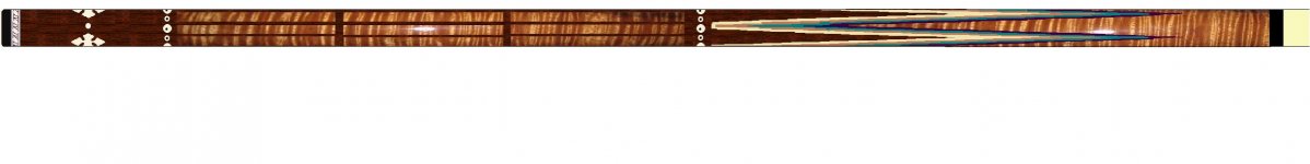
Bob Dzuricky is a great guy to work with! Top notch communication and craftsmanship. He completed this Davis blank ahead of schedule and was very faithful to my original design. The inlays at 'c' and 'd' represent a particular pair of drums I play called Tablas, and came out better than I had hoped for. The ferrules and joint are cueball, and Bob's stash shaftwood is very nice! The cue plays strong.
You are using an out of date browser. It may not display this or other websites correctly.
You should upgrade or use an alternative browser.
You should upgrade or use an alternative browser.
Something different from DZ cues...
- Thread starter JillHawkCueCases
- Start date


Very cool cue....Bob did a great job. Congrats !!
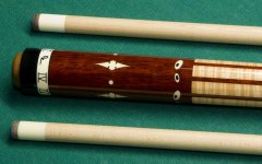
Real Nice cue! Looks like it has a real nice comfortable taper on the butt. Just listened to your band also and you have a new fan ") very cool sound. Just curious but what's the significance of the roman numeral 4's on the hoppe ring?
very cool sound. Just curious but what's the significance of the roman numeral 4's on the hoppe ring?
Good shooting to you!
Kevin
very cool sound. Just curious but what's the significance of the roman numeral 4's on the hoppe ring?Good shooting to you!
Kevin
Very cool and unique!
i agree...neat cue with a cool twist...
Real Nice cue! Looks like it has a real nice comfortable taper on the butt. Just curious but what's the significance of the roman numeral 4's on the hoppe ring?
Thanks for all the comments.
It is nice to see to see so much support of Bob's work.
The roman numerals are just an additional amount of customizing, as I am the fourth to carry my name. I think they look good down there, and really tie the room together.
Clyde
ive always had ton of love for bobs work. This takes the cake. the attention to the exact details his customer wanted with their design. kudos on the new cue have fun with it. and bob, good show man.
Bob spent a lot of extra time to ensure that this cue was what I wanted. If you will notice the faux rings at 'c' and 'd,' they are tipped ovals on the cue, but simple circles in my design. I was very inpressed when Bob contacted me, "...I was just about to begin designing your inlays and had a question for you. Instead of making ivory circles with small ebony circles, how's if I make the ivory & ebony dots in a slightly oval shape -as it probably looks to you when you're playing. This will give them more realism, I think. It might also make them more interesting than if they are just circular. Let me know what you think."
I think he was right...
Very nice cue. I hope people will appreciate how Bob worked the inlays in the wrap area to keep it looking like one piece of curly.
It's the little things that count.
Yep, you are absolutely correct. Bob not only painstakingly alligned those windows (by both the horizontal curl and the verical grain,) but he also slightly tapered each of them. Because the diameter of the stick is growing, if all of those window were cut the same size with straight edges, the padauk wood inbetween would be very narrow at the top of the wrap and widen as it moved down. By tapering those windows, the lines of padauk run straight. I think these two aspects really make this design.
Attachments
I am a big fan of Bob and his work ofcourse. Clever how he also incorporated his logo in the hoppe ring.