Yes another Logo... Feedback please....

The Renfro

Outsville.com
Silver Member
I work on these late at night which is why I am always asking for feedback since everyone in the house is asleep but me......

I am thinking maybe using blue instead of the yellow and green to tie in but when I think of something throwing off a glow I picture it like the comic books LOL...


View attachment 380241
 
Last edited:
Shannon.spronk

Anybody read this?
Silver Member
I like it. I guess I would probably try the blue. I think that will work better. The other thing is the gap between Iodine and Tellurium. I know that you typically have a dash in there, but in this instance it kind of just appears like the spacing is off there. I think I would either keep the same gap as everything else or I would open it up even more so that it appears to be a definite intentional gap. Other than that I think it looks good though.
 

The Renfro

Outsville.com
Silver Member
I like it. I guess I would probably try the blue. I think that will work better. The other thing is the gap between Iodine and Tellurium. I know that you typically have a dash in there, but in this instance it kind of just appears like the spacing is off there. I think I would either keep the same gap as everything else or I would open it up even more so that it appears to be a definite intentional gap. Other than that I think it looks good though.

Will definitely open the gap further so it looks intentional... May even try the blue.. Who knows? Am seriously just learning this stuff... I can use autocad for engineering stuff but pretty/semi cool is new to me....
 

Shannon.spronk

Anybody read this?
Silver Member
Will definitely open the gap further so it looks intentional... May even try the blue.. Who knows? Am seriously just learning this stuff... I can use autocad for engineering stuff but pretty/semi cool is new to me....

I do plenty of engineering type things and often need to move between different types of engineering software. I like each for certain things. Graphic design is certainly not something I know a whole lot about and I certainly wish you the best with everything you are doing. I like your progressive approach and thinking.
 

TATE

AzB Gold Mensch
Silver Member
Too busy and too many shadows. I would lose the shadow on the "better cueing through modern" line, or reduce it, and on the "Kitech" boxes too, but keep the green shadow. It should will make the green shadow stand out more. The logo also contains a lot of text information that may detract from the name brand and overall message. Overall it is an interesting approach but I would try to simplify it. I personally find the "Te" imbalance the most interesting part of the logo and would keep it as is. If it were me I would keep the KiTech boxes, delete all other text on them and have the logo just say "KiTech Better Cueing Chemistry".
 
Last edited:

Busboy

Wanna Play Some?
Silver Member
Too busy and too many shadows. I would lose the shadow on the "better cueing through modern" line, or reduce it, and on the "Kitech" boxes too, but keep the green shadow. It should will make the green shadow stand out more. The logo also contains a lot of text information that may detract from the name brand and overall message. Overall it is an interesting approach but I would try to simplify it. I personally find the "Te" imbalance the most interesting part of the logo and would keep it as is. If it were me I would keep the KiTech boxes, delete all other text on them and have the logo just say "KiTech Better Cueing Chemistry".

I think it looks great but I'm with him about losing the better cueing through modern" line other then that looks good think the blue might look cool :thumbup:
 

Gangplank

Registered
I agree. Remove the shadow on the "Better cueing through modern" and move that wording up to where the shadow is.

Also is the F = -kX needed? It looks like you are trying to include a bad word without spelling it out.
 

cleary

Honestly, I'm a liar.
Silver Member
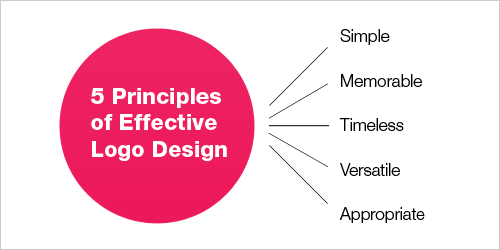
When creating a logo, here are some helpful tips.

principlesofeffectivelogodesign.gif
 

ideologist

I don't never exaggerate
Silver Member
Looks like a Breaking Bad knockoff. If that is the look you are going for, great.
 

slide13

AzB Silver Member
Silver Member
There is a lot going on....some really heavy handed drop shadowing especially. I think it needs toned down and tightened up a little. I appreciate the design concept though and I think something could be there.

Edited to add: I think something like this would serve as a better logo, needs to stay pretty simple and scalable. I think the KITECH part stands out more, the other text in each square is smaller, slightly lighter, and all of a uniform size. It's not exactly pretty or exciting, I just tossed it together as an example of what I was talking about.

KiTech.jpg
 
Last edited:

The Renfro

Outsville.com
Silver Member
OKies thanks for the feedback so far... Am killing all the drop shadows and doing a few of the other changes.... I like leaving the F=-kX formula so people have to ask what that is... It's Hooke's Law concerning spring compression which is the whole reason leather works and most rubbers do not work as far as tips are concerned... The reason synthetics work for break tips is that the contact is so brief that even tho they really don't act much like a spring the law still applies.....
 

Mr. Bond

Orbis Non Sufficit
Gold Member
Silver Member
Good advice from Cleary. Form follows function don't ya know :)

Excuse me for asking, but what does the word kitech mean? Where did it come from?

I would shrink the boxes a bit so that it's easier to tell that there is a word being spelled.
( can't assume people know that kitech is a word)

Then add the word in front of the catch phrase: kitech= better cueing etc.

Keep color scheme simple for reproduction purposes ( t-shirts etc) and easy ID from a distance.
 

The Renfro

Outsville.com
Silver Member
Good advice from Cleary. Form follows function don't ya know :)

Excuse me for asking, but what does the word kitech mean? Where did it come from?

I would shrink the boxes a bit so that it's easier to tell that there is a word being spelled.
( can't assume people know that kitech is a word)

Then add the word in front of the catch phrase: kitech= better cueing etc.

Keep color scheme simple for reproduction purposes ( t-shirts etc) and easy ID from a distance.

ki - the circulating life energy that in Chinese philosophy is thought to be inherent in all things; in traditional Chinese medicine the balance of negative and positive forms in the body is believed to be essential for good health
chi, ch'i, qi

I take it to represent balance... Which is what we try and shoot for... We balance hardness with the actual playability expected for different grades of tip... Everything we do is very close on Shore D so they don't change from play but they all are adjusted to different levels of COR so I can hand you 4 tips that are all within a few points on Shore D but over the 4 you will have a difference in COR of 20 Points....
 
Top