Brand new Scruggs just in

twilight

AzB Silver Member
Silver Member
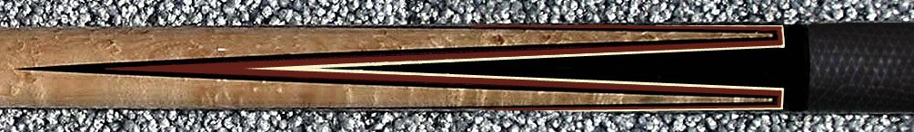
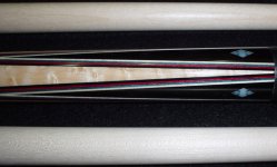
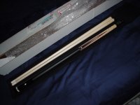
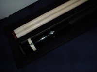
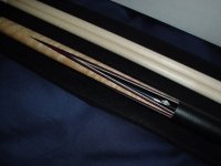
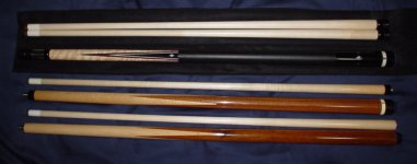
My first truely custom cue by Tim Scruggs. Built to my specifications :) Thought I'd go with a simple hoppe style with a few inlays. Just delivered to my door 10 minutes before pictures were taken. Don't have time for better pics at the moment but here's a few I'd like to share. Oh and a couple of his sneakies, now I have a small family.
 

Attachments

  • DSC01092.jpg
    DSC01092.jpg
    91.6 KB · Views: 358
  • DSC01094.jpg
    DSC01094.jpg
    86.3 KB · Views: 299
  • DSC01096.jpg
    DSC01096.jpg
    92.2 KB · Views: 278
  • DSC01098.jpg
    DSC01098.jpg
    89.4 KB · Views: 246
Last edited:
Have to agree - congrats!
Very nice looking cue and I am sure you are going to love the way it plays.

Myron
 
You are a lucky man!

Super cue. It really has the old Balabushka style and I always liked the abalone and mother of pearl look in a cue. You will love the hit and playability for sure!
It's like Chrismas I bet and I know exactly what you feel. Joy!
Thanks for sharing
Nick
 
god.. one of my next cues is deffinatly going to have red veneers like that.. every time i see them my jaw drops.. I WILL own a cue like that someday..

chris
 
and that's with a bad flash, the veneers really come out with good lighting. I have to agree that red comes out very well. Red really pops out well next to black. Also the colors are based on the artistic principle of triadic harmony, aka primary colors RED BLUE YELLOW. I picked a vibrant red as it stands out against black, but a darker blue to help the red but not stand out too much, and the maple veneer is close to a muted yellow. Cuemakers of the past have used this before, (i bet they knew something) but usually it's a darker maroon and a light/pale blue. I wanted richer and deeper colors. If i could get the flash to work it'd stand out better.

I couldn't spend a fortune on design or inlays so I thought I'd do it subtle way by picking colors that work well. There's actually a lot of thought behind the cue.
 
ChrisOnline said:
god.. one of my next cues is deffinatly going to have red veneers like that.. every time i see them my jaw drops.. I WILL own a cue like that someday..

chris

Chris, I agree with your sentiments about the veneer combo! The veneers on my next cue will look a little something like this: *the inlays have been removed to protect the innocent :D*
 

Attachments

  • veneers.jpg
    veneers.jpg
    94.9 KB · Views: 318
Simple, elegant and classy, plus I think it hits great ! Very nice design and it's nice that the TS family of yours has a new member. They're like a father with two almost identical sons. :)
 
zeeder said:
Chris, I agree with your sentiments about the veneer combo! The veneers on my next cue will look a little something like this: *the inlays have been removed to protect the innocent :D*


ooh... yeah... now your talking.... not only are they red.. box points are saweet tooo :)
 
I just let one of my buddies get this!

That is one sweet cue you have there sir!! Here was mine:)
Middle one!


IM000017.jpg


Hay wait they are all red! The middle one was the one that came to mind. I made sure to let one of my friends have dibs!
Scruggs cues are truely built for a life time of enjoyment!!
Nick
 
Last edited:
one more of the veneers
 

Attachments

  • DSC01107 copy.jpg
    DSC01107 copy.jpg
    99.3 KB · Views: 233
Last edited:
Like the simple design

That, in my opinion, is tough for us to do, but they always look the best is clean, simple designs.

I guess I am meaning restraint.

Excellent cue and what I would be looking for or design.

Ken
 
Back
Top