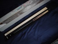
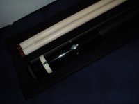
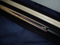
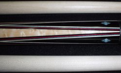
and that's with a bad flash, the veneers really come out with good lighting. I have to agree that red comes out very well. Red really pops out well next to black. Also the colors are based on the artistic principle of triadic harmony, aka primary colors RED BLUE YELLOW. I picked a vibrant red as it stands out against black, but a darker blue to help the red but not stand out too much, and the maple veneer is close to a muted yellow. Cuemakers of the past have used this before, (i bet they knew something) but usually it's a darker maroon and a light/pale blue. I wanted richer and deeper colors. If i could get the flash to work it'd stand out better.
I couldn't spend a fortune on design or inlays so I thought I'd do it subtle way by picking colors that work well. There's actually a lot of thought behind the cue.
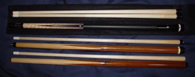
 Thought I'd go with a simple hoppe style with a few inlays. Just delivered to my door 10 minutes before pictures were taken. Don't have time for better pics at the moment but here's a few I'd like to share. Oh and a couple of his sneakies, now I have a small family.