Just wondering opions on differant logos on cues out there
You are using an out of date browser. It may not display this or other websites correctly.
You should upgrade or use an alternative browser.
You should upgrade or use an alternative browser.
Cue logos?? UGLY... and nice looking ??
- Thread starter brianna187
- Start date
brianna187 said:Just wondering opions on differant logos on cues out there
Logos on factory cues usually aren't to bad. McDermott's logo isn't bad at all, gold on a black background so that it's not "in your face" so to speak. I don't like logos on Custom cues however. This gives me the impression that the Custom Cue is falling into the factory cue realm. No personality. Does the Custom Cue maker put out so many cues that he can't give a little personal touch for identifiability? Just my not so humble opinion.
Dick
I too agree with rhncue but I think a small emblem of some sort says something about the cue. I have a McDermott and I think the shamrock is a nice touch but about half the size or smaller would be much better. I have a Ray Schuler "SLC" cue. I am not knocking it as it is one fine playing instrument. But when you have a 2" long by 3/4" high script signature that is inked on as a sales tatic, it takes away from the beauty and the history of the cue maker. I personally prefer a small signature somewhere on the wood itself to be a better touch for a custom cue.rhncue said:Logos on factory cues usually aren't to bad. McDermott's logo isn't bad at all, gold on a black background so that it's not "in your face" so to speak. I don't like logos on Custom cues however. This gives me the impression that the Custom Cue is falling into the factory cue realm. No personality. Does the Custom Cue maker put out so many cues that he can't give a little personal touch for identifiability? Just my not so humble opinion.
Dick
Purdman said:I really hate it when they sign them between the points. You have a beautiful cue and a signature that looks like a three year old signed it.
Amen to that!
I don't know why custom cue makers do this. It totally detracts from the beauty of the cue, and like Purd said, most do NOT have great penmanship anyway. About the only *possible* exception would be Ernie at Ginacue. He has a very unique signature, and it looks pretty nice. Although with the "G" on the bottom, I still don't think it's needed.
I guess I don't see ANY need to sign the cue in more than one place, and doing so is just complete overkill. Maybe they do it in case the cue is cut in half and can use the markings to identify it?

If I had to pick a favorite way to identify a cue, it would be those who have their logo/sig on the pin like Capone, Bender, Omen, SW, etc.
That gets the job done AND keeps the cue clean looking!
i agree i know.... i will not mention names but it ruins the cue and this person has been told that for years it actucally hinders his sales
Yeah whats up with that Balabushka guy signing the forearm?
JV
JV
My personal favorite is when a cuemaker uses a Hoppe ring and then nicely engraves his name. Hercek is a nice example. He doesn't do every time. But, I sure like it when he does. Schick is another. Or I have seen James White with just his initials. I like that, too.
Just my opinion,
Jimmy
Just my opinion,
Jimmy
Last edited:
Generally speaking with logos, here's my take. Small and fluid = GOOD.....big, bold, blocky, and overpowering = BAD. Just my opinion and as with most rules, there are some exceptions.
Some that I really like that come to mind are Ginacue, Ernie Martinez, Tad, McDaniel, JMW, Even that bugger Ted Harris had a pretty nice logo going.")
Some that I really like that come to mind are Ginacue, Ernie Martinez, Tad, McDaniel, JMW, Even that bugger Ted Harris had a pretty nice logo going.
I like the engraved ones
I guess I agree with the group. I like the Schick, Tad, James White, Scruggs. Small and tasteful logos.
Gilbert cues, and Sean would be an excellent resource if he would help here. Andy used to just use a G now he signs and I think it takes away. Could you show both?
I know that Ernie got bugged to sign cues and that is reason he does them now. I have a Gina and the logo is great but I dont like the signature.
LIKE EVERYONE ELSE, JMO.
ken
cueaddicts said:Even that bugger Ted Harris had a pretty nice logo going.
Did he engrave a watch? or a calendar?
JV
cueaddicts said:Generally speaking with logos, here's my take. Small and fluid = GOOD.....big, bold, blocky, and overpowering = BAD. Just my opinion and as with most rules, there are some exceptions.
Some that I really like that come to mind are Ginacue, Ernie Martinez, Tad, McDaniel, JMW, Even that bugger Ted Harris had a pretty nice logo going.
I just thinking how much I actualy like the Ernie Martinez logo.
Ken_4fun said:I guess I agree with the group. I like the Schick, Tad, James White, Scruggs. Small and tasteful logos.
Gilbert cues, and Sean would be an excellent resource if he would help here. Andy used to just use a G now he signs and I think it takes away. Could you show both?
I know that Ernie got bugged to sign cues and that is reason he does them now. I have a Gina and the logo is great but I dont like the signature.
LIKE EVERYONE ELSE, JMO.
ken
I like the small engraved ones too - guess thats why I did a "brand".
Purdman said:I really hate it when they sign them between the points. You have a beautiful cue and a signature that looks like a three year old signed it.
Like I said, JMHO.
Purdman
i used to hate that too until i saw some that just were done tastefully like Josey, of course
") , and Tascarella. i do like a small well designed logo, either engraved or inlaid in the butt cap ie Schon, ect.... depending on the maker i also like the whole last name or initials engraved just under the sleeve in the butt cap running around the cap....Szamboti, B.S, ect.......
, and Tascarella. i do like a small well designed logo, either engraved or inlaid in the butt cap ie Schon, ect.... depending on the maker i also like the whole last name or initials engraved just under the sleeve in the butt cap running around the cap....Szamboti, B.S, ect.......Ken_4fun said:...Gilbert cues, and Sean would be an excellent resource if he would help here. Andy used to just use a G now he signs and I think it takes away. Could you show both?...
Ken,
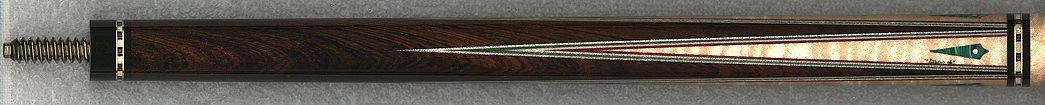
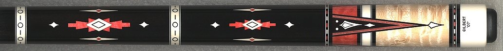
I looked back through my pics and I could not locate any old "G" logo cues, although we have several. Will try to see if Matt has any pics of these handy. In the early years, he used a simple engraved "G" in the butt caps that he cut in with his old panto. For at least ten years, Andy has been using the micro pen that a lot of guys are using. It is small and he signs them small. I personally don't dislike a signed cue, but I would definitely prefer it to be small. The last couple of years on special run cues (like the two batches Andy made for the SBE shows plus several other high end orders), he has been engraving Gilbert in a small font plus the year on the butt cap. I really like those. Attached are example pics of the signed version vs. the new style "high end" engraved butt cap. Resolution is not good because they are just the scans, but anyone reading that isn't familiar with his work should get the idea.
Attachments
i think ernie has one of the best signatures. his handwriting looks pretty neat... i also like the placement, sometimes i think a signature can look a little off-balance if its written on one of the points.