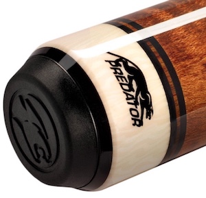
Are there any cue makers whose signatures/logos really turn you off? I have a few I dislike. For production cues, it's Predator:

If Predator would make some of their cues without the logo, I think they would look better. Without the logo, the cue could still be identified as a Predator cue by the bumper, which has a more subtle Predator logo stamped into it.
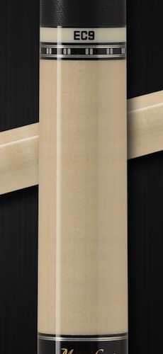
I dislike the way Mezz puts the model number on some of their cues:

Overall, I think the Mezz EC-9 looks really nice, but the ring with the model number ruins the cue for me.
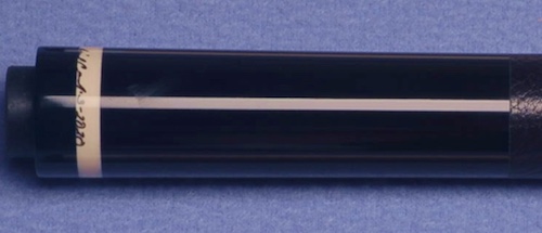
For custom cues, I dislike some of Ariel Carmeli's signatures on his cues. I really like Carmeli cues, but sometimes I see his signature, and I think, "God, he went to all that work to make a beautiful cue, then he ruined it when he signed it." For instance:

To me, that looks terrible! I'm glad Ariel Carmeli sometimes uses the AC logo.
I'm not a fan of signatures near the points of a cue. You better have a neat, stylish signature, like Tascarella, or a simple, clean logo like Randy Mobley, if you put your mark near the points, otherwise I think it ruins the look of the cue.
If Predator would make some of their cues without the logo, I think they would look better. Without the logo, the cue could still be identified as a Predator cue by the bumper, which has a more subtle Predator logo stamped into it.
I dislike the way Mezz puts the model number on some of their cues:
Overall, I think the Mezz EC-9 looks really nice, but the ring with the model number ruins the cue for me.
For custom cues, I dislike some of Ariel Carmeli's signatures on his cues. I really like Carmeli cues, but sometimes I see his signature, and I think, "God, he went to all that work to make a beautiful cue, then he ruined it when he signed it." For instance:
To me, that looks terrible! I'm glad Ariel Carmeli sometimes uses the AC logo.
I'm not a fan of signatures near the points of a cue. You better have a neat, stylish signature, like Tascarella, or a simple, clean logo like Randy Mobley, if you put your mark near the points, otherwise I think it ruins the look of the cue.
Last edited:

