You are using an out of date browser. It may not display this or other websites correctly.
You should upgrade or use an alternative browser.
You should upgrade or use an alternative browser.
Picture Presentation?
- Thread starter thingie
- Start date
The layout of B looks better to me
good job
I voted B as well. Mainly because I liked that the whole cue view was not interrupted. Both are done very well. Nice cue as well. could you create a C view were you have the Butt on the top right (where you have a snap shot of the forearm currently) and replace the Butt Cap fram with the closer view of the forearm?
I voted B as well. Mainly because I liked that the whole cue view was not interrupted. Both are done very well. Nice cue as well. could you create a C view were you have the Butt on the top right (where you have a snap shot of the forearm currently) and replace the Butt Cap fram with the closer view of the forearm?
Last edited:
Hi Joel:
I like how B is presented. The layout & lighting in most the pictures look great, good job. A couple of thoughts...
The pictures on the bottom right have a dark shadow that is distracting.
In some of the pictures the blue cloth background is very worn and unsightly. I would use a section of table that has less visible wear.
Keep up the good work.
Bryan
Hi Joel,
Looks like a landslide for option B. I liked it better because the butt-sleeve is in bigger view. Maybe you could add another picture of it, 4 fore-arm pictures vs 1 butt-sleeve maybe 3 and 2 would be better, but that's just me. I might also try to give the full-view picture a bit more room, maybe use a 45 deg edge on the fore-arm and handle picture. I also like a close-up of the points/veneers, espescially in a Skip.
gr. Dave
p.s. no shafts?
It's funny how one little insert can change how you view and respond to a series of photos
Group A has the butt picture inserted in where it takes your eye away from the picture of the "whole" cue
And second.....It is interesting in how we view things, as americans, we will almost always start our viewing at the top left. This is how we have been taught to read (top left) and that carries over to a group of pictures on a page.
So you will always want to put a more interesting (more appealing) image at the top left.
Group B has the above things going for it and that is why I think most people will like it better
I think in order to properly judge the disposition of the cue comparative to the atmospheric light surrounding the still object, I would recommend sending the cue to me..........so that I can play with it?
Ok, my attempt at obtaining the cue failed, so I will say that Layout B is a better presentation of the cue in my opinon.
Ok, my attempt at obtaining the cue failed, so I will say that Layout B is a better presentation of the cue in my opinon.
thanks for the responses, will try to work on the suggestions.
Prob will invest in a nice cloth as a background so they all come out even (instead of some worn/some new cloth)
I didn't take the shafts on this one cuz its not for sale but I was just playing around with the pictures to see what I could get. I would take the shafts if i was planning to sell the cue or if the owner wanted it.
The bottom right picture in B has that dark shadow cuz of the angle it was taken, couldn't spread my flash all around the cue heh. Will work on it to see what I can do.
Will be playing around more with collages and see what I can do") Thanks for the responses and votes so far
Thanks for the responses and votes so far
Prob will invest in a nice cloth as a background so they all come out even (instead of some worn/some new cloth)
I didn't take the shafts on this one cuz its not for sale but I was just playing around with the pictures to see what I could get. I would take the shafts if i was planning to sell the cue or if the owner wanted it.
The bottom right picture in B has that dark shadow cuz of the angle it was taken, couldn't spread my flash all around the cue heh. Will work on it to see what I can do.
Will be playing around more with collages and see what I can do
Thanks for the responses and votes so far I chose "B" but...
Well for still motion it is definitely B.
You have it correct as it should: Keeping eye movement in important areas.
For motion graphics.... I like A better. It all depends on the motion.
Well for still motion it is definitely B.
You have it correct as it should: Keeping eye movement in important areas.
For motion graphics.... I like A better. It all depends on the motion.
'B' looks good. Maybe try to center the Cue, since that is the focus. The pictures out to the far right side I really didn't notice right away, since my eye was guided to the whole cue, then to the immediate corners.
Maybe try to place the cue from the lower left corner to the upper right, add three pictures in the upper left, and three in the lower right. The image might be more balanced
my $0.02
Brian
www.nittanyleather.com
Maybe try to place the cue from the lower left corner to the upper right, add three pictures in the upper left, and three in the lower right. The image might be more balanced
my $0.02
Brian
www.nittanyleather.com

I agree with Ken
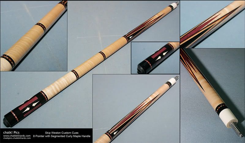
and you need pics of the shafts as well. Also looks like the two upper sections of the wrap are a different shade than the lower 3rd section? Is that the photo or the wood?
Pauly
Slider said:"B" is my favorite, but I really like the fact that "A" includes a tighter shot of the points. Mixing the cue orientation in the shots has to be done carefully, or the result is unsettling.
Ken
and you need pics of the shafts as well. Also looks like the two upper sections of the wrap are a different shade than the lower 3rd section? Is that the photo or the wood?
Pauly
I explained why I didn't photo the shafts in the posts above.paulybatz said:and you need pics of the shafts as well. Also looks like the two upper sections of the wrap are a different shade than the lower 3rd section? Is that the photo or the wood?
Pauly
It is the wood not the photo. The 3rd segment has a lil less figure than the front 2.