You are using an out of date browser. It may not display this or other websites correctly.
You should upgrade or use an alternative browser.
You should upgrade or use an alternative browser.
Help Me Choose Which One I Print and Start To Sell
- Thread starter pletho
- Start date
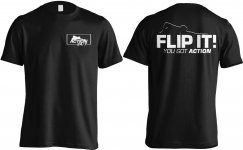
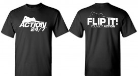
Small logo and nice shirt.
Sent from my SCH-I605 using Tapatalk
Sent from my SCH-I605 using Tapatalk
Vote sent for small logo on front.
They both look pretty good. The large logo on the front is prob ok for a t-shirt. If you do a polo shirt with a collar, keep the front small.
Thanks to all of you who have participated, it's really hard to decide
sometimes what designs I should print, and you all have been a great help!
It is kinda wierd that over 320 people have viewed this post, but only a few
responses, but please keep up the responses, good or bad, that's the point to
this type of post.
I always consider "any" input, good or bad as valuable input.
Last edited:
Big Front Logo.
Small logo and nice shirt.
Sent from my SCH-I605 using Tapatalk
This
.
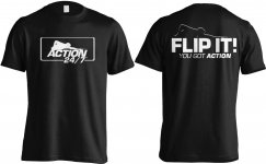
I like the right one for a tee shirt. Pretty cool.....John B.
I like the design. Its clean. Font and concept is very Predator logo-ish though. First thing that popped in my mind anyway.
Of the two I like the big front logo.
Interesting, I never even thought of Predator at all, didn't even enter my mind....
Thanks for you input though Justin
i voted SMALL. but, the larger font will get you more notice. smaller is cleaner for men to wear.
as for WOMEN....if you ran the larger font, and deleted the border, and lowered it a couple of inches to be strategically placed....it'd be one hell of an attention-getter.
as for WOMEN....if you ran the larger font, and deleted the border, and lowered it a couple of inches to be strategically placed....it'd be one hell of an attention-getter.
i voted SMALL. but, the larger font will get you more notice. smaller is cleaner for men to wear.
as for WOMEN....if you ran the larger font, and deleted the border, and lowered it a couple of inches to be strategically placed....it'd be one hell of an attention-getter.
Lol..... You never know, I may do a combination, make several different ones available.
Top one.
Don't be a hypocrite and pay the extra $ and print it on U.S.A. made shirts and you have a guaranteed sale right here.
If you planned it already I apologize.
Unfortunately selling t shirts unless you buy in very large bulk orders isn't a very profitable business in the first place.
This shirt if and when printed/made will either be on Hanes or Gilden whichever I can get for the best price.