You are using an out of date browser. It may not display this or other websites correctly.
You should upgrade or use an alternative browser.
You should upgrade or use an alternative browser.
Looking for logo help, Tina Pawloski
- Thread starter girlwon1
- Start date
tina, my 0.02 ask azb'ers to see what they can come up with. Ive u havent checked the post about the new AZB logo, u should. u will see many people have secret design skills in her. im sure it might be a bit complicated as the person doing this is a client/friend, and never easy to say to that kind of person u dont like the work, or it isnt as u espected, but this is business, nothing personal, always keep that in mind.
The more profesional it looks, to more proffesional people will handle u.
The more profesional it looks, to more proffesional people will handle u.
Tina,
The pdf image is not a logo..not one of much use anyway.
You need to identify a USP (Unique Selling Point). In your case I think it is your attractive face and body shape.
I'd suggest you have a graphic 'cartoonish style' that captures the strong assets of your image and includes some graphic reference to pool.
The attachment is just a simplistic sample. Should be more recognizable or stylistic.
Colin
Attachments

Last edited:
Ah yes ...
Colin has a good idea, and perhaps with a little slogan like
'Setting a new style in Billiards' which indicates a double meaning, your personal style about yourself, and your play in Billiards. Or you could go
for the wierd funny slogan like 'Pollocks can play Pool'. Actually, sometimes my sense of humor takes off exponentially when it gets going sometimes .... lol I thiought of changing your last name to Paw-Paw, can capitalizing on an oriental nuance and a native american nuance ... catchy, though, don''t you think ... Tina Paw-Paw .... ROFL
Colin Colenso said:Tina,
The pdf image is not a logo..not one of much use anyway.
You need to identify a USP (Unique Selling Point). In your case I think it is your attractive face and body shape.
I'd suggest you have a graphic 'cartoonish style' that captures the strong assets of your image and includes some graphic reference to pool.
Colin
Colin has a good idea, and perhaps with a little slogan like
'Setting a new style in Billiards' which indicates a double meaning, your personal style about yourself, and your play in Billiards. Or you could go
for the wierd funny slogan like 'Pollocks can play Pool'. Actually, sometimes my sense of humor takes off exponentially when it gets going sometimes .... lol I thiought of changing your last name to Paw-Paw, can capitalizing on an oriental nuance and a native american nuance ... catchy, though, don''t you think ... Tina Paw-Paw .... ROFL


jnav447 said:I noticed whoever did the logo misspelled the word "billiards" (they've got "billards"). That would kinda make me think about shopping around. My .02 is that you can get something quite a bit better - you should have a logo that's as attractive as you are.
Amen. tap-tap-tap
Also to the comments that a logo looks better in rectangular shape.
So minimally the cue should be horizontally oriented (and level, like a good stroke). The cue could be the top of the T in Tina, or serve as an underline. I think having a paw in there is good, maybe two ("Paws," like "Jaws" is for Ron Jaworski of NFL fame), but as the dot in the i is too much cutes for me. A cue ball could be placed at the business end of the cue, like a period ending that thought...or, though it might be too cute - if the cue were the top of the T, a cue ball could be the dot over the last i.
As to color, you need some, but, almost all logos have to be printed sometimes in B&W - even for big mega companies - so I'd worry first about getting the design / layout right. Truthfully this one isn't.
You could spend a little money and get a real pro like from an ad agency or design firm - a printer's designer normally works fast on stuff that tends to be temporary...I think you want to be more than temporary on the pool scene, no?
You could spend less and get a DIY software - even if you did hire a pro, you could work out some ideas this way
Or, and this would really be fun for the forum, gather some of the ones here (or from the people submitting them to you) & have a forum poll / vote to decide.
In any event, you deserve much better.
girlwon1 said:Thanks for the responses, everyone. They made me a logo for the promotional kit as mentioned, but this is also for mailing labels, business cards, letterhead. I thought it too was a bit simple and the cue a bit undone looking. These people are helping me out with this design, the printer is a client of mine for what I do, and he is helping me out this way with one of his designers. I am supposed to meet with them tomorrow, Friday at 230. Thanks again, everyone!
Tina
My $.02 worth..
I am a jewelry designer and also do some of the artwork and design for our pool room in Saint Louis. I have some ideas for you and your logo. First of all I wouldnt skimp on design charges and go with the cheapest person. Dont be afraid to question your designer and make them do it over. Make them explain the pschology behind their ideas and design. Does that match up with yours? A logo should reflect you and the specific market you are trying to appeal to. A logo if done correctly should not need to be updated on a regular basis. You can always use the logo in different ways depending on the advertising message you want to send. Different colors and textures on the same logo can give you an large number of variables to use. I agree with whoever said to put it on everything you own, sell, represent. Jeanette Lee outside of the pool world, is just known as the Black Widow by half the general public. Using your nickname or motto or alter ego can do wonders for marketing yourself to the public at large. Just make sure it matches YOU. I remember meeting Melissa Little at a BCA event one time. Her nickname is the Viper. I remember thinking how sweet and unassuming she was. Didnt seem to match up to the "Viper" as an alter ego. Although maybe her demeanor changes on the table and I just havent seen that side of her professionally. Just something that sticks in my mind. I remember doing some research on logo design a while back while designing new tee shirts. A lot of good advice I got from companies was "Keep it simple" Make it so you dont have to READ anything to know what the logo represents..who you are..what it means...Most people recognize the Coca Cola stripe instantly. The NIke Swoosh. Keep it simple. Good luck with your design. Looking forward to seeing it. Craig
I am no artist, nor am I talented in that area, but that logo doesn't seem right to me.
When looking at it the eyes go right to the cue stick and follow it up - to where? And what is that funny looking ball?
I would go with a horizontal cue stick and perhaps a 9 ball at the tip.
Maybe dot your eyes with cue balls; a 9 and an 8 or just two 9's. But it might look too cluttered or cheap. Like people who use circles instead of dots for i's.
TINA PAWLOSKI (Left of center with large type)
Professional Pool Player
Cue stick here with 9 ball.
Address info here (Right of center)
Then you might want a 9 ball rack in the upper right corner. Or beter yet the logo that Deanna drew. That has class. Contact her and hire her.
You can use her logo on your shirts and everything else and then incorporate it into your business cards and stationary.
Don't rush into it because you want to keep it for a very long time.
My friend uses TP as a logo on the cues that he makes. He says it stands for tight pockets. I think Bert Kinester also uses TP.
Jake
Last edited:
Jaden said:I heard chris asked you to marry him, and you noticed that he already had a ring on his finger?
What Chris are you talking about? No one has asked me to marry them since 1995.
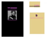
bruin70 said:is this a cover brochure or a business card?
They are making me business cards, letterhead, envelopes, the works. I did have to go to the meeting today and just started with her taking the cue stick out all together and changing the font on my name. I really am trying to get one promotional kit together and ready by the time I have to go to North Carolina. This kit is for a non-industry sponsor, for possibly 20 thousand.
girlwon1 said:They are making me business cards, letterhead, envelopes, the works. I did have to go to the meeting today and just started with her taking the cue stick out all together and changing the font on my name. I really am trying to get one promotional kit together and ready by the time I have to go to North Carolina. This kit is for a non-industry sponsor, for possibly 20 thousand.
the brochure needs her pic on the cover because you are promoting HER.
don't use contact info on the cover because it does nothing for the design.
you need a font change...nothing blocky. you want gracefull.
one idea would be to have an identifying, UNIQUE logo, that is small, concise and will be on everything.
logo can be something as mundane as billiard related imagery(ho-hum) to a clever logo built around her initials.
nice choice of paper stock is REALLY important. it will lend class.
don't do hand drawn images. it looks cheap.
if it's for non-industry you will DEFINITELY have to promote her look. that's the hook.
everything should be color coordinated, but not EXACT. ie,,,if you decide on black/pink for the brochure cover, there should be some black or pink on everything else but not necessarilly exactly as the colors are displayed on the brochure. black and pink fonts, for instance.
do you have a pic of her?
the example i show is using color as the common design element. you can use anything,,,logo,,,pic,,,whatever
btw...i had an idea as i was mocking this up. if you take a look at the letter head, i did a logo of her initials, and i sprang a fower out of it's top. howz about a pink rose sprouting from an 8 ball???
Attachments
Last edited:
bruin70 said:the brochure needs her pic on the cover because you are promoting HER.
don't use contact info on the cover because it does nothing for the design.
you need a font change...nothing blocky. you want gracefull.
one idea would be to have an identifying, UNIQUE logo, that is small, concise and will be on everything.
logo can be something as mundane as billiard related imagery(ho-hum) to a clever logo built around her initials.
nice choice of paper stock is REALLY important. it will lend class.
don't do hand drawn images. it looks cheap.
if it's for non-industry you will DEFINITELY have to promote her look. that's the hook.
everything should be color coordinated, but not EXACT. ie,,,if you decide on black/pink for the brochure cover, there should be some black or pink on everything else but not necessarilly exactly as the colors are displayed on the brochure. black and pink fonts, for instance.
do you have a pic of her?
the example i show is using color as the common design element. you can use anything,,,logo,,,pic,,,whatever
btw...i had an idea as i was mocking this up. if you take a look at the letter head, i did a logo of her initials, and i sprang a fower out of it's top. howz about a pink rose sprouting from an 8 ball???
Thanks Bruin for taking the time put that together. I did have them take the hokey cue out, and are changing the font to be a bit more feminine. That new style is taken throughout the book and the pictures are definately spread throughout with many used, around the short bio, long bio, cover letter, and accomplishments. On the cover of this letter bound book, there is a space for my picture right in the middle. These are some of the pictures that will be used...
http://azbilliardsforum.myphotoalbum.com/view_album.php?set_albumName=album04
Thanks!
Tina
T
Timberly
Guest
I like it!!breakup said:For whatever it's worth, a rough draft of other options")
")
Hey Tina!
Talk to Ray Britt he is great with logo's and designs and he will stay away from pink to
How come you didn't tell me about your proposal??? I thought I'd at least get a wedding invitation .
hilla
Talk to Ray Britt he is great with logo's and designs and he will stay away from pink to
How come you didn't tell me about your proposal???
I thought I'd at least get a wedding invitation .hilla


T
Timberly
Guest
Very nice Deanna, I like all of those.Deanna Michelle said: