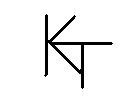
I think it would look much better like this:
Crude & Simple idea that I'm considering, but there may be programs that can make it look a little better or just some fellow AZers opinions would be great, Thanks....It will be engraved in the butt cap or Hoppe ring NOT handwritten, because my handwriting sux

Id suggest hiring a graphic designer to get some input outside the pool community. The logo should reflect maybe your style or philosophy. Just having your initials doesnt set you apart anymore. Tim Scruggs had TS for a long time. Too many cuemakers in the world these days. If its just going to be your initials, do all of them in silver or gold or something to make them stand out.
Google "KT logo" and look at what you will be competing with if someone is looking for you. Theres a lot of KT logos in the world.
EDIT: I just saw you spell your first name KENNE. That's original enough to stand out. Engraving a cue "by KENNE" would be something different at least.

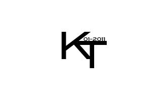
Maybe like this? Nice compact clean and professional .
you. are welcome to use it or maybe it will give you some ideas

Pool Cue Warehouse.com
EDIT: I just saw you spell your first name KENNE. That's original enough to stand out. Engraving a cue "by KENNE" would be something different at least.
I actually agree with this. I think "KENNE" would be a much better logo design. Plus, it would be more unique and distinctive. Good idea!
I like that logo a lot. :smile:
I went on VistaPrint which has a "free" logo design software. I came up with this.
I think it's hard to notice the "KT" letters on that logo..
This one is a little different

Let me add that my initials of JAM gave me a chuckle one time. I was asked to do a job for the United States Marine Corps about the Iraq War. Imagine my shock when I realized my initials stood for an armed militia known as Jaish al-Mahdi (JAM). I was wondering what the Marine Corps would think if they knew their job was performed by JAM! :embarrassed2:
If you want professional help with your logo, go to 99designs.com. They have hundreds of graphic artists that will compete in your contest to design the perfect logo for you or your company. And it costs less than #300! You will choose from 70-100 entries and the contest only lasts six days at most, unless you see one you want and end the contest early.