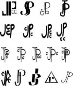
Sorry guys if I havent responded or put much feed bac into this I thought it would kinda run its self and at the end I would comb thru ur post and pic one and then contact the winner and fine tune it so again sorry if u guys dont think I went about this the rite way -jim pierce-
Jim,
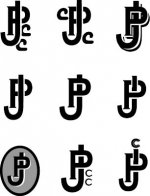
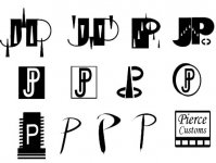
It's fine what your've done, but we don't know what you like or want to represent with your image. We just know that you want the logo to be compact.
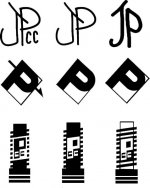
For example, my logo designs require a decal or at least a laser engraving. Maybe you want an easier shape to inlay?
I personally think the decal is the way to go because it's versatile and the quality will be high. They are easy to replace if the cue get's refinished or the buttcap is broken.
So, here are some questions:
1. Do you like more modern fonts, or more retro?
2. Do you want logo's with initials, or your full name?
3. Do you want images in addition to text? In other words, do you want a "mark" like the Nike swoosh that people can easily identify your cues.
4. Do you want your logo to convery a theme? For example, I was thinking you were in Montana (maybe not current) and might like the great outdoors, but maybe weaponry, the wild west, animals or something else would be more appropriate.
5. Are you going to use a decal, inlay, silk screen, or engraving?
6. Do you want it to be black and white, or color?
7. What exact dimensions do you want for your logo? That way we can scale it to the photos and give a better idea what it will look like.
8. Do you want just a logo for the butt of a cue, or one that can be expanded for your web site?
Anyway, these are the quations that went through my mind.
Chris


")