Hey Guys,
I have been lucky enough to have a freind who is a graphical designer help me with developing a logo for my cues. He has sent back a couple of proofs and I wanted to throw these out there to get some opinions.
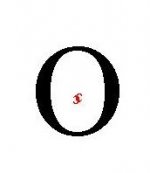
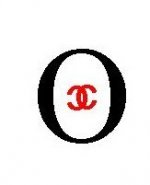
The original concept was to use the O in my last name and the image of "cross hairs" from the scope of a rifle. The second image is just an alternative that he developed without any input from me.
I am not married to either image. So, please do not hold any punches about what you really think. One concern that I have is the use of the red dot. I know Leonard Bludworth uses a red dot only. I am not sure if incorporating that into my logo comes too close to his designation or not.
I would also like the cuemakers to judge it based on practicallity and ease of engraving it into the butt of the cue.
As a final side note, the cue in the picture is not one I built. My friend just grabbed the image to mock up this proof. If it is your cue, please do not be offended. I will not be using it in the final product.
Here are the best two we have so far:


I have been lucky enough to have a freind who is a graphical designer help me with developing a logo for my cues. He has sent back a couple of proofs and I wanted to throw these out there to get some opinions.
The original concept was to use the O in my last name and the image of "cross hairs" from the scope of a rifle. The second image is just an alternative that he developed without any input from me.
I am not married to either image. So, please do not hold any punches about what you really think. One concern that I have is the use of the red dot. I know Leonard Bludworth uses a red dot only. I am not sure if incorporating that into my logo comes too close to his designation or not.
I would also like the cuemakers to judge it based on practicallity and ease of engraving it into the butt of the cue.
As a final side note, the cue in the picture is not one I built. My friend just grabbed the image to mock up this proof. If it is your cue, please do not be offended. I will not be using it in the final product.
Here are the best two we have so far: