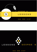
I'm doing some quick business cards for a friend, and need to figure which direction to go. I did a couple quick designs and wanted a little feedback which you guys like better. Just a quick word or two (thumbs up, thumbs down) is fine.

pwd72s said:I like the one with both 8 and 9 ball...
Irish634 said:Me too, but I think George's name needs to be higher. Just a thought.
Kevin Lindstrom said:I agree with this suggestion.
Of the two I like the one without the large balls, the one with the diamond I like better. But generally I think the black doesn't work, but it could be just me.StevenPWaldon said:I'm doing some quick business cards for a friend, and need to figure which direction to go. I did a couple quick designs and wanted a little feedback which you guys like better. Just a quick word or two (thumbs up, thumbs down) is fine.

cleary said:I think the bottom one is the better of the two. I would personally drop the type down a little and make sure the are equal distance from the edge....it seems "george g" is closer to the edge than "lessons". Also, maybe bump the phone number up like 5 pixels.
With the cheap printing now a days, i would personally like to see this as two sided. One side with the 9 ball rack design, the other side with the info stacked in the center.
StevenPWaldon said:Like this?
StevenPWaldon said:I'm doing some quick business cards for a friend, and need to figure which direction to go. I did a couple quick designs and wanted a little feedback which you guys like better. Just a quick word or two (thumbs up, thumbs down) is fine.
cleary said:...sorry, im a design nerd
StevenPWaldon said:I'm doing some quick business cards for a friend, and need to figure which direction to go. I did a couple quick designs and wanted a little feedback which you guys like better. Just a quick word or two (thumbs up, thumbs down) is fine.
cleary said:I think the bottom one is the better of the two.
StevenPWaldon said:So back to the basic question regarding which direction to go in, I'm afraid that the 2nd one might come off as a little pretentious. I mean, these are pool players after all. I wonder (fear?) that the top one might be a little better given the audience.
Personally I like the bottom one much much more. But will people pay attention or respond to it?