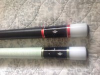
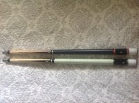
These cues are many years in the making. About 8-9 years ago I purchased the acrylic rings that are now unobtainable. I sat on these rings until about 2 years ago when I sent them to the Tascarella's to see if they could incorporate them into a couple of cues. Pete Tascarella Sr was totally thrilled to get his hands on material he said has been unavailable since the '60s. He incorporated some Balabushka butt sleeves in both cues, the black is acrylic, not ebony. Here are the results. I love them, and will test drive them tomorrow when I get to the pool hall. Sorry for the crummy pictures, they are 10 times nicer in person. Which one do you like best? I can't decide!
You are using an out of date browser. It may not display this or other websites correctly.
You should upgrade or use an alternative browser.
You should upgrade or use an alternative browser.
:~: Tascarella Pair, Balabushka copies :~:
- Thread starter skierlawyer
- Start date
those cues just ooze class...
Beautiful, Bri....love 'em. Classic as it gets, right there. :thumbup::thumbup:
Beautiful, Bri....love 'em. Classic as it gets, right there. :thumbup::thumbup:
Great looking cues. No more classic than those...
JV
JV
Beautiful cues. The Tascarella's did an excellent job on them. And I first hand know how rare that acrylic is. I had also lucked into some of it.
The reflective characteristics of red stuff is cool looking stuff to see in person.

The reflective characteristics of red stuff is cool looking stuff to see in person.
")
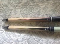
I'll swim against the tide as usual and say I like the top cue best . The design and layout have balance . The three black rings at the a-Joint in cue number two just look off to me, almost like a mistake. Where the top cue with only two has symmetry . JMO
Both are fantastic and I would be proud to own them.
Both are fantastic and I would be proud to own them.
I'll swim against the tide as usual and say I like the top cue best . The design and layout have balance . The three black rings at the a-Joint in cue number two just look off to me, almost like a mistake. Where the top cue with only two has symmetry . JMO
Both are fantastic and I would be proud to own them.
Well you not swimming alone lol... I like the top cue as well. That one needs a picture beside fatboys Bushka this cue is a tribute of.
Sweet pair! I like the Cortland on the second cue but overall I vote for the top one, love the rings and color scheme.
Thanks everyone for all the great comments. In person the rings look almost see thru and have subtle sparkles in the sunlight. I can't wait to hit some balls. The bottom cue is an exact copy of Irving Crane's Balabushka. The rings are not symmetrical and I think that makes it cool. The top one has a perfect smooth leather wrap.
Last edited:
There's no skool like old skool! They are both awesome. I like the bottom one best, but it's a real close race between the two.
both are heavenly cues!! they must hit real sweet as well as they look! i just love classic looking cues. Thanks for sharing and happy shooting with your new cues!!! :smile:
Brice
Brice