http://forums.azbilliards.com/showthread.php?t=24691
when I go to this thread I have to move my cursor over to read the whole message ?
when I go to this thread I have to move my cursor over to read the whole message ?
Gunn_Slinger said:http://forums.azbilliards.com/showthread.php?t=24691
when I go to this thread I have to move my cursor over to read the whole message ?

Gunn_Slinger said:http://forums.azbilliards.com/showthread.php?t=24691
when I go to this thread I have to move my cursor over to read the whole message ?
The same is true in the other style... to a somewhat lesser extent.Gunn_Slinger said:http://forums.azbilliards.com/showthread.php?t=24691
when I go to this thread I have to move my cursor over to read the whole message ?
iacas said:The same is true in the other style... to a somewhat lesser extent.
And to those complaining about avatars leading to "wasted space," this theme is actually far more compact - the other theme wasted space on top of every thread.
I can make the background area white... there. Done. This also makes the content "pop" just a little more, so... perhaps it will stay like this. The other background was #eeeeee, which is just about as close to white as you can get without being WHITE.
")
justabrake said:I don't know about what opions were said , didn't even read it but my opion is, this isn't what brought me here it was an easy reading forum easy on the eyes and very navigational , to me this new look is an eyesore and I have a dell 20 inch screen and IMO it should be put back to it's original look, there wasn't anything wrong with it from the start.
have you ever herd, going from good to worst well here it is> IMO
Steven
")
pbat2751 said:I don't know if its the background being white or gray but I think the text itself needs to be either darker or a larger font.
not bold and bold or maybe arial black
Donovan said:OK so I was wrong, I did a complete study of sizing. I am wrong. The new style may look like it takes more scrolling, but it doesn't really. In some cases it is shorter by a lot, and where it is longer it barely is. SO sorry about all of that. Keep on trucking Erik!
Donovan said:Do you know if we are still going to have a contest on banner designs? I mean we need one for both styles anyway. Can you make those banners rotate also? on both styles? Just curious.
Shorty said:Just curious...did anyone else lose the ads with the new skin?
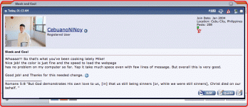
CebuanoNiNoy said:Whoaaa!!! So that's what you've been cooking lately Mike!
Nice job! the color is just fine and the speed to load the webpage
has no problem on my computer so far. Yap it take much space even with few lines of message. But overall this is very good.
Good job! and Thanks for this needed change.
The old one required you to scroll past people's avatars just to see what they had to say.I've been reading all these "whoa" type statements but saw, other than the forums were a bit shuffled, no difference. I normally use Firefox, I opened the forum using IE6 it looked a lot different. Is the new skin compatible with Firefox, or is it a cookie issue, that is causing it?iacas said:I don't see it in the other theme, either. Where was it?