The problem with what you're doing, Rod, is a fundamental one in cue design - you're designing a single inlay and then hoping to create an attractive cue from that one shape, perhaps (as seen above) by slathering that shape all over the surface of the cue from one end to the other.
That approach works for table clothes, flannel shirts, and paisley pajamas, but on a pool cue it fails - if for no other reason than sheer boredom on the part of the viewer.
A pool cue presents a difficult canvas for one simple reason - the shape of the canvas is unlike any other. A wrapped cue has two distinct sections (laid out "flat"); one is about 3 inches X 12 inches and the other is about 4 inches X 4 inches. Alternately, if the cue is wrapless (and inlaid full length) the canvas is a very long 29 inches X 2 1/2 - 4 inches (tapered).
Making sense of such a canvas takes a lot of thought as a designer, which is why you almost never see an "old school" cue with much inlay in it. Of course, the points do give us an excuse to step away from the 3 X 12 canvas and focus our inlay work on the much easier 4 X 4 section. This is one reason why you rarely see a Black Boar cue with much inlay work above the wrap. I know, I know... they say they don't inlay the fronts much because it "affects the play of the cue", but one must admit this also very conveniently avoids solving the artistic conflict of two drastically different canvases. Now, before all you Black Boar fans jump in to protest, let me just say that many of the buttsleeve inlays they've done over the years have been some of the most beautiful in the industry.
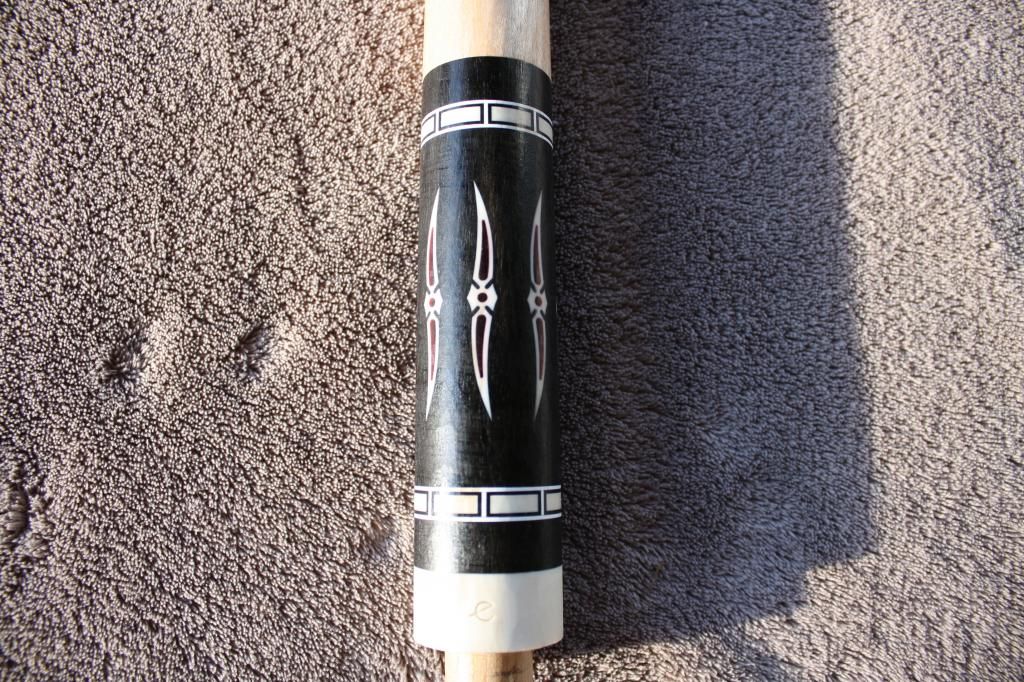
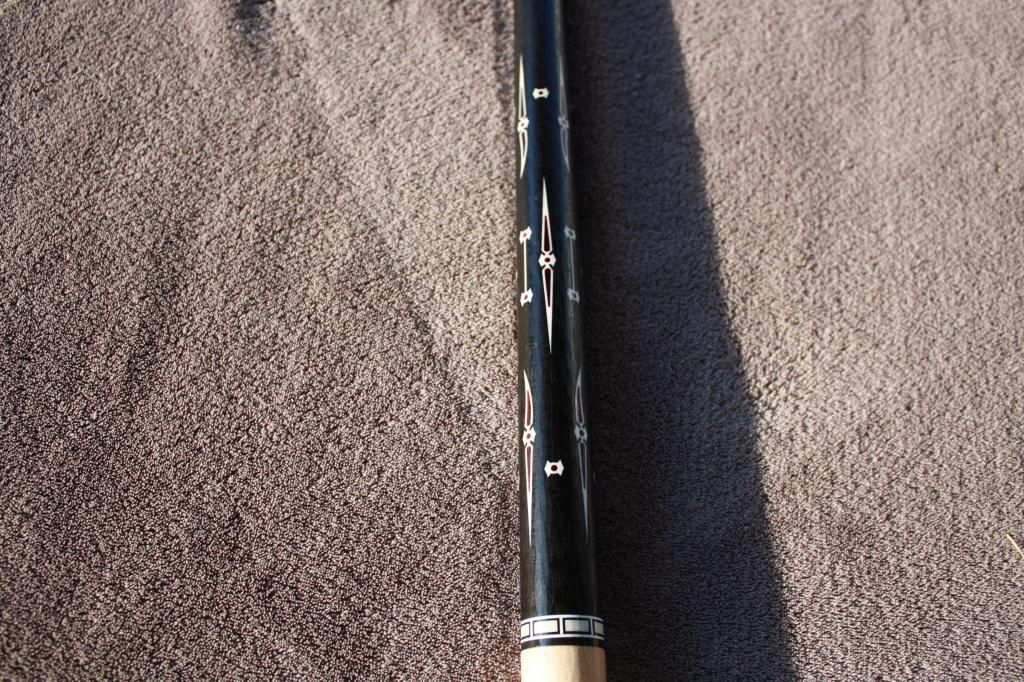
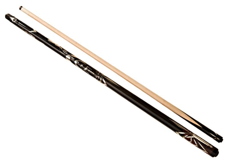
Here are two distinct examples of what I'm talking about,. The first exemplifies the idea of taking one basic inlay shape and simply dropping it in all over the cue - Rick "scdiveteam" Gershay's Scimitar Cue"
Buttsleeve:
Forearm
***************************************************************************************************************************
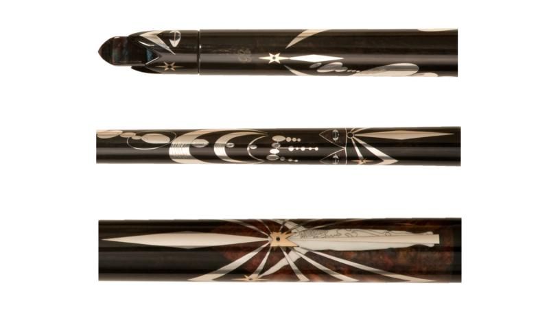
This second cue is one of my very favorite cues of all time - Richard Black's Visitation (I like this cue so much I almost bought it):
Now I'm sure Rick "scdiveteam" will consider this a dire criticism of his work, and will come back with all kinds of over-the-top personal attacks on me. But I'm willing to fade that unpleasantness because I think this is such an important lesson for budding cue designers to learn.
The Scimitar Cue has one basic design - its "scimitar" shape - and that design (or very slight variation) simply repeats all over the cue - in what can only be seen as an attempt to fill up space with ornamentation. Nothing especially wrong with that... but it's hardly "high art". In fact, I consider it the mark of a failed design - a failure I have made myself too many times to count.
Because of this, the Scimitar Cue can be seen and understood in its entirety at a single glance. Pick it up and rotate it in your hand - you're looking at the same repeat pattern over and over. Table clothes, flannel shirts, and paisley pajamas....
Black's Visitation, on the other hand, could be a master class in how to take a design idea and make it into a masterpiece. The photos you're seeing here represent only a small portion of the actual design work in the cue. I have personally held this cue several times and turned it around and around, following the intricate blend of symmetry and asymmetry with utter fascination. I've also been there when several others have held it and done the same thing - including cuemaker Jake Hulsey. Even after holding (and studying) the cue for a long time it's impossible to fully take it all in - most viewers return to it again and again for further study.
There's certainly room (and a market) for both approaches. But if you want viewers (and future cue historians) to sit up and take notice of your design efforts, Rod, you're going to have to put in a lot more work. None of the shapes you've posted here are "bad" by any means. They're just not complete, and by themselves will never make a cue truly beautiful. You can take that as an "insult" if you like, but you'll get a lot more value out of it if you think of it as a really good lesson.
TW
Caution: This is commentary on art as such. Person you don't like long winded posts should be advised in advance.
TW,
I certainly don't take what you have described as an insult
By any means. All of us hear on the forum can gain by your words, direction and experience of over 30 years. What is the nuts is that we all get to gain from you sharing your thoughts as HOFer and it is free!
The functional art cue you show that Richard Black created is awesome indeed and very creative. I have no knowledge of Richard's clients that he builds cues like this for but if I were to guess I would think that cue's value is north of 20,000.00 to a collector of means. It may be double that or even higher? I highly doubt Mr. Black's cue will see much table time because it is an art object that should be displayed.
My Scimitar is not an art cue. It is a Fancy Player that has inlays that just adorn the cue with some symmetrical order. This is a 2500.00 cue built for someone who wants a playing cue and likes symmetry. These people do exist and are out there.
As an example to this discussion, Miles Davis was a young talented side man who was on the 1940s 50s New York Jazz scene during the evolution of Bebop and he played with the Giants or visionary monster players, Charlie Parker and Dizzy Gillespie.
In the 1950s Miles developed his own jazz style that was known as Cool Sound. This style was based on minimalism where by he broke from his predecessors, Byrd, Diz and Armstrong. He played every note clean and straight up never using a slur, trill or glissando. This sound was the 4 phase of the evolution of Jazz music.
Later Miles broke away from the Cool Jazz sound and went Avant Guard in style and there were many persons who appreciated jazz that rejected the Avant Guard style. The musicians were not limited to Key Signatures, modes or constrains of a uniform tempo.
Richard Black has evolved into a style that could be likened to Miles' Avant Guard style of playing because of the free form unrestricted freedom it affords to the artist. He can create his art without the limits of symmetry and can also focus on shape created by the blind areas between his inlay geometries. Very cool indeed as was the case with Picasso's Cubism Art style.
My point is that there are many people who still like symmetry and only want to pay 2 to 3 grand for a fancy player. After all we got to be paid for our time.
I my minds eye I look a your work with amazement and would compare it to Miles' Cool Sound 4th Generation of the Jazz evolution category. Richard has taken his art to more of a free form and cerebral place in his personal evolution as a Cue Artist throwing symmetry to the wind. Very Cool. By doing this he like Miles has gone his own way and a few people who want what Richard has done in his past may be disappointed. They just don't understand that the artist needs to grow and not stand still.
As a musician for over 50 years I had to woodshed for many many years learning different tunes, scales, cordial progressions, arpeggios, harmonies, modes and rhythms before I could play spontaneous improvisational jazz. Singing through your instrument. Building cues like the Scimitar Cue is the same as practicing scales and progressions ect. on my journey toward free form functional art cues someday in my future. I have a lot more wood shedding to do and many miles to walk in my journey.
I look forward to seeing what your next evolution in style has to offer and I am sure you have some stuff up your sleeve or in the works. At your age and experience I figure you have a few more major milestone style changes and growth still left in you gas tank before you hang it up. Those changes will have direct effect on all cue makers. I have no doubt that you will transcend Richard's offering as that's how these thing work generationally. We all can see over our own horizon when we can stand of the shoulders of visionaries.
We are all evolving one baby step at a time. It never stops even for industry leaders like you and Richard. It that respect we all are in the same boat, one oar stroke at a time.
Evolution is extremely incremental.
JMO,
Rick

") or die whichever comes first.
or die whichever comes first.