You are using an out of date browser. It may not display this or other websites correctly.
You should upgrade or use an alternative browser.
You should upgrade or use an alternative browser.
Cue Inlay designs. Anybody have any new ideas.
- Thread starter Shooter08
- Start date
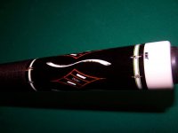
Here are some I came up with about 11 years ago and worked with Jim White to build the cue. A broken diamond and a lazy S.
Scott
I like that a lot.. Nice job Scott
I like em all
plain janes are becoming more popular with nice rings
a simple hoppe style has always been one of my favorites
but then again i bought about a dozen ivory wrapped cues
Larry Vigus made me some 1 piece butt(from joint down)
that not only play good but grow on you for looks
South west cues makes some of my favorites
at first it was" the hit",but the basic look and perfect work
still thrills me
At one time they did some fancy cues that I keep hoping
might come back,They were the first to make wrapless (or at least the first I ever saw)
Szamboti/Balabushka designs became classics,relatively basic but amazing
funny how my taste is influenced by cue makers that are friends,what ever they do I like
i wish i had kept a few Mottey box cues,Paul is or was the most under rated
Hit,feel balance,presiscion ,taste ,balance,the works
Bob Owen makes them for me now,in fact I have
one in the works now,I left the complete design up to him
But I digress
Last edited:
I like that a lot.. Nice job Scott
Thanks! That means a lot coming from you.
Scott
Johnnybgood
Banned
Thanks for the nice comments. Which cue, from the pics posted earlier in the thread, did you see in Billiards Digest? What was the year and month of that issue?
I will get you the info. The cue was featured. There is at least one pic of it in this thread.
Sent from my iPhone using AzBilliards Forums
Johnnybgood
Banned
The pic you're talking about is the first pic in Bavafongoul's post. To know who I've worked with view my profile. As to not agreeing with my views on "structure and function" maybe you can elaborate on what our differences are?
There was a cue of mine in the May 2017 BD edition but I'm not sure if thats the cue Johnnybgood is talking about. It was a Gambler cue.
This is the cue. Not a gambler. I just grabbed the thread from this thread.

Sent from my iPhone using AzBilliards Forums
This is the cue. Not a gambler. I just grabbed the thread from this thread.
Sent from my iPhone using AzBilliards Forums
Yep. I found out is was in this Septembers edition so I ordered a back issue and sent one to Bob as well. "Gieser Sights" as I thought was appropriate, gothic cameo's and 6 piece props. Just took the mag out of the mailbox..Got to check it out
")
Rather then a boring wrapped handle,or burl handle, I designed a unique feature. My cue has a clear plastic handle which is hollow. I can disengage the buttcap and add or remove liquid! Along with the liquid I can add anything that fits like glitter if I am going to play at the strip club,50 dollar bills if I am going hustling. I have even added betta fish to que the fairer sex's attention. Thinking about this I could get inlays and float them! Thanks to the opportunity for getting to think about this.
Attachments

Last edited:
Johnnybgood
Banned
Yep. I found out is was in this Septembers edition so I ordered a back issue and sent one to Bob as well. "Gieser Sights" as I thought was appropriate, gothic cameo's and 6 piece props. Just took the mag out of the mailbox..Got to check it out
Cool! I REALLY like this cue. I liked it the moment I opened the mag and looked at it. It’s probably not for everyone but, I would find it as a keeper.
Sent from my iPhone using AzBilliards Forums
For the past year, I have been tinkering with a new cue design with a unique theme and inlays.
It's just about finalized, except for the colors which I'm still debating which would be the best look.
But alas, unless I relocate, this design will accompany me to my grave since it has a lot of ivory.
Many people endorse Elforyn, Juma, et al. but unless it's actually ivory, it just doesn't cut it for me.
JC
Coos Cues
Nothing wrong with a plain jane cue at all, but sometimes the look of a traditional 4 point 4 veneer cue is pleasing to the eye. There are plenty of variations in design from people like Bill McDaniel, Mike Cochran, Leon Sly, Denis Deikman, Steve Lomax etc. To each their own, none of it affects playability just a matter of taste to the person holding it.
I agree with most of this but the last sentence. When you cut out 80% of the base wood of a forearm and replace it with glued in inserts made of veneers and decorative wood it most certainly changes the way the cue hits. This is the construction of most pointed cues. Is it bad? Well that's subjective of course but it isn't nothing.
JC
JC
Coos Cues
Dude, why didn't you name the thread "I hate inlays!"... Too funny
You should change your user name to "I love inlays" based on your avatar and signature photo. Equally funny.:lmao:
JC