You are using an out of date browser. It may not display this or other websites correctly.
You should upgrade or use an alternative browser.
You should upgrade or use an alternative browser.
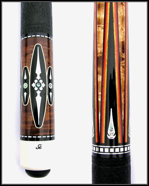
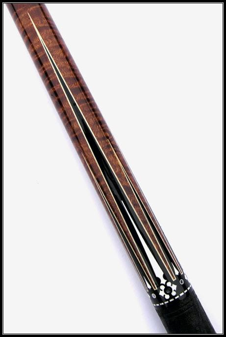
Ginacue pics: experimenting, let me know your thoughs
- Thread starter JimmyRayK
- Start date


Great looking cue!!!
As for the pictures, I think that they are a bit over exposed.
I also think that you should try get less background either by placing the cue at 45 degrees or straight and crop the unnecessary background.
I took the liberty to adjust them a bit..... what do you think?
As for the pictures, I think that they are a bit over exposed.
I also think that you should try get less background either by placing the cue at 45 degrees or straight and crop the unnecessary background.
I took the liberty to adjust them a bit..... what do you think?
Great looking cue!!!
As for the pictures, I think that they are a bit over exposed.
I also think that you should try get less background either by placing the cue at 45 degrees or straight and crop the unnecessary background.
I took the liberty to adjust them a bit..... what do you think?
As was previously stated, the butt caps are blown out. The reflections are a bit distracting as well. Nice product though!!
These are some great Pics Jimmy .... keep experimenting and may try some different angle ")
Best
Berny
Best
Berny
dave sutton
Banned
Little too much white imo but pics look good. Id toy with backround color. Maybe an off white ir baby blue
OOPS....
looks like I mixed two cues in one photo but you get the idea...
Really looks nice.................thanks a bunch.
Good Photo illistrations.
Little too much white imo but pics look good. Id toy with backround color. Maybe an off white ir baby blue
Dave
Thanks for the feedback...................
I totally agree with your comments. This was my first attempt at something new. I will do some more stuff with cues at different angles, different lighting and backgrounds. Just playing around.
JimmyK
My retinas are on fire...... Imo the all white background is too bright. The pics came out nice though.
Your pictures show the details of the cues very nicely - sometimes although a picture is perfect (it isn't blurry and the brightness is correct as well) you still can't see the details because of shadows and the angle used.
With yours that is not the case, the details can be seen nicely.
I'd choose a little different background with some texture in it - like a white sheet or curtain - as that would give you some instant feedback about the brightness of the picture. If you can see the texture of the background the picture is good but if you can't it's over exposed.
Without changing anything else you can reduce the brightness by choosing a little bigger shutter time (or smaller, I mean 400-600-800 or so).
Anyhow, I really like the pictures and the cues even more. Is the second cue an 18B? I wanted to see a quality picture of one of those for such a long time.
jimmy, what affect are you going for in "trying something new"?Trying something new. Give me some feedback.
Thanks in advance...............
JimmyK
white background would be hard to work with . . . reflects so much light.
also may not compliment the ivory in the cues.