You are using an out of date browser. It may not display this or other websites correctly.
You should upgrade or use an alternative browser.
You should upgrade or use an alternative browser.
New Logo
- Thread starter seahorse1877
- Start date
Cool !!!!!!!!
Hi,
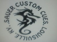
I like it a lot but would flip the Louisville KY over so it can be read right side up.
JMO,
Rick
I like it a lot but would flip the Louisville KY over so it can be read right side up.
JMO,
Rick
Last edited:
Hi,
I like it a lot but would flip the Louisville KY over so it can be read right side up.
JMO,
Rick
Ditto. I like it, flip the print around.
It kind of reminded me of a tattoo somebody I know has:

Your name means SOUR in german, so what is the seahorse conection?...JER
I have a dragon tatoo on my forearm, my buddy was making fun of me on poker night and called it a seahorse. The name stuck and now I have a large seahorse tatood on my other ARM.
Sent from my PC36100 using Tapatalk
Sent from my PC36100 using Tapatalk
I like it, but to be recognized from more than a foot away, you should simplify it. Not that I'm a fan of theirs, but McDermott's logo is recognizable from 10 feet or more. Same goes with most of the major makers. Just some food for thought.
Logo
We do embroidery and we are with Rick flip Louisville so it reads rightside 2 and ditch the dots replace with a lateral diamonds instead this gives a stylistic separation and doesn't clutter the logo. The other thing is totally subjective is to take the font down just a little to give your company name some separation. But your looking great....looking forward to seeing the final draft.
Jim
I like it I like it !!! Agree with the others flip the ville and lose or only 1 dot per side .
Looks like a production cue logo...sometimes less is more.
Good luck with your logo.
Good luck with your logo.

