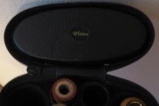
Their new stylized "W" button is growing one me. I have always been partial to the old school Whitten tag. Which treatment would you prefer?

If you want to see more, check out the case forum!

If you want to see more, check out the case forum!
")